Vitacost Tentpole Events
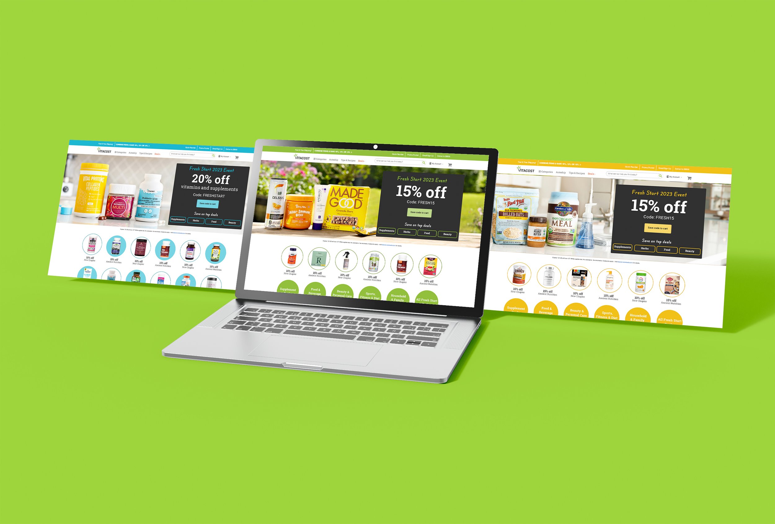
Beginning in 2014, Vitacost expanded its tentpole promotions from a single annual Black Friday event to a quarterly campaign calendar. The year included the Fresh Start Event in January, the Anniversary Sale in spring, the Summer Cyber Sale in August, and the Black Friday and Cyber Monday campaigns in November.
Each campaign introduced a large-scale creative takeover across the entire website, supported by coordinated assets for email, social media, and paid advertising. I served as both art director and graphic designer for these campaigns.
Campaign Layout and Styling
Every campaign was given a distinct look inspired by the time of year and the story behind the sale. Each promotion transformed the homepage through a unique visual takeover, led by oversized, full-width hero banners that often incorporated animation.
The approach evolved significantly over the years. Early campaigns relied on bold, eccentric static banners to capture attention, while later executions became more refined and brand-focused—maintaining their visual impact while feeling more connected to Vitacost’s identity.

Iconography
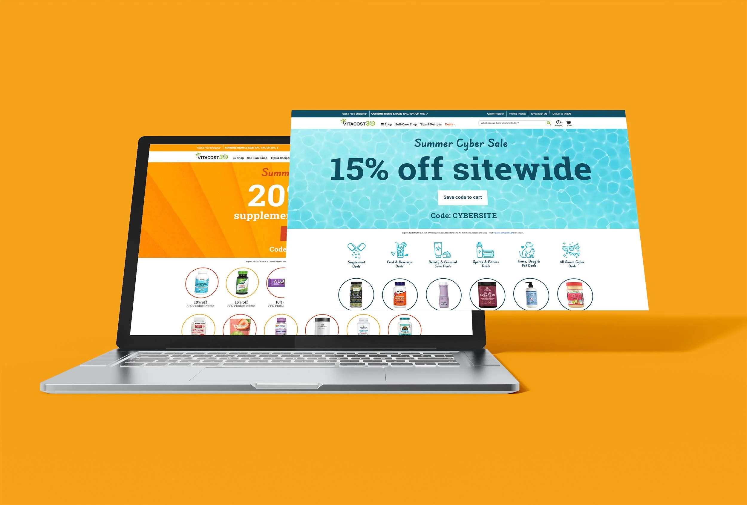
During the event, the first six circular modules—typically reserved for promotions and brand highlights—were repurposed to feature category-specific iconography. The line-art style created a visual balance between lifestyle and product imagery while keeping the promotion-heavy experience from feeling overly crowded.

Animation
Over time, the hero modules for these events evolved from static product imagery to motion-based backgrounds featuring either lifestyle video or animated textures. The example above uses a moving water texture created for one of the Summer Cyber Sale campaigns.
Photography
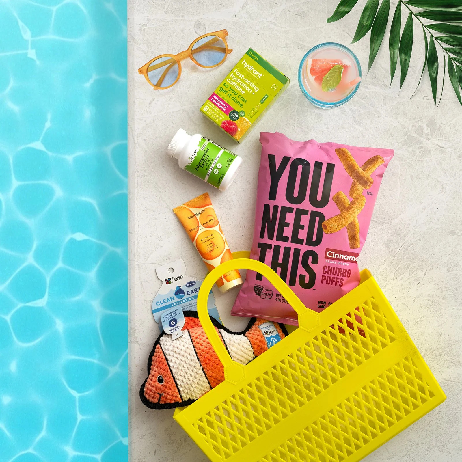
I collaborated closely with Vitacost’s in-house photographers throughout these campaigns, producing custom imagery for both the website and external marketing channels. Together, we established a visual style for each campaign and planned multiple compositions and angles to accommodate the different formats in which the photography would appear.
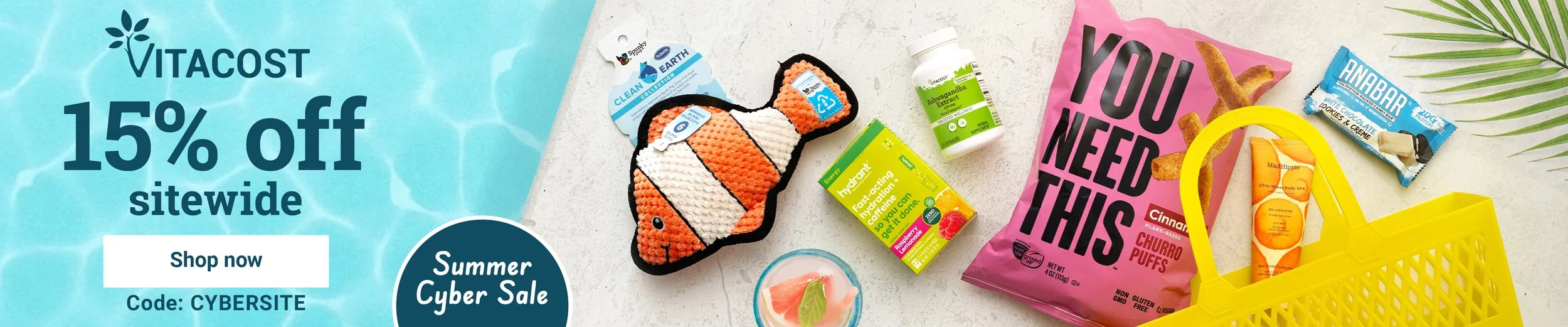
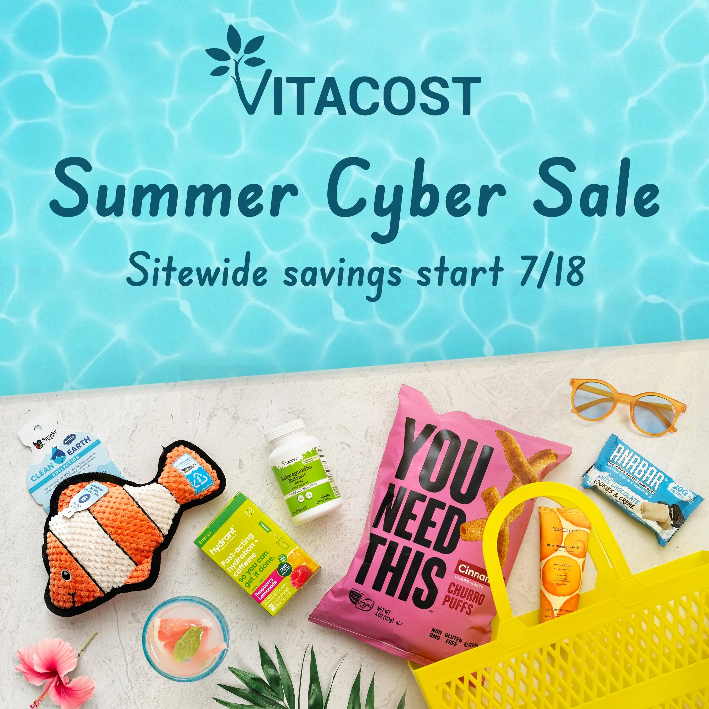
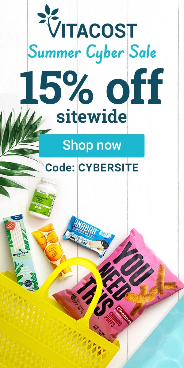
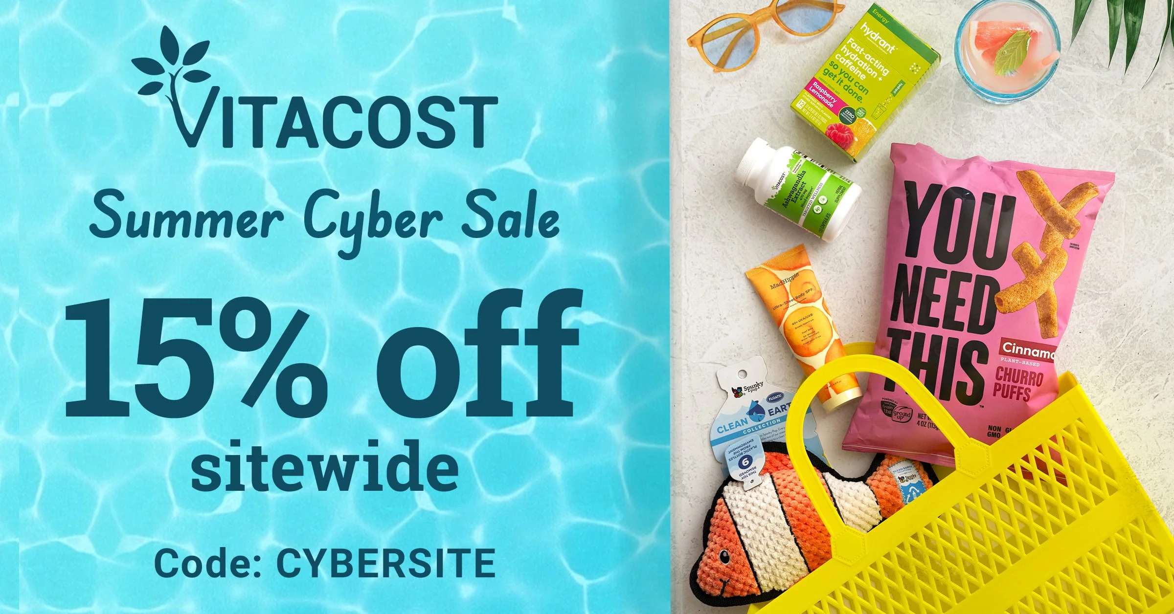
Every campaign extended into a broad paid media presence across multiple platforms. To create a unified experience, each asset carried the campaign’s visual identity and message while being thoughtfully adapted to its placement. I collaborated with the photographer to establish the overall composition and visual direction. The resulting shoot produced images from multiple angles, giving me the flexibility to design assets across a wide range of sizes.
Paid Media

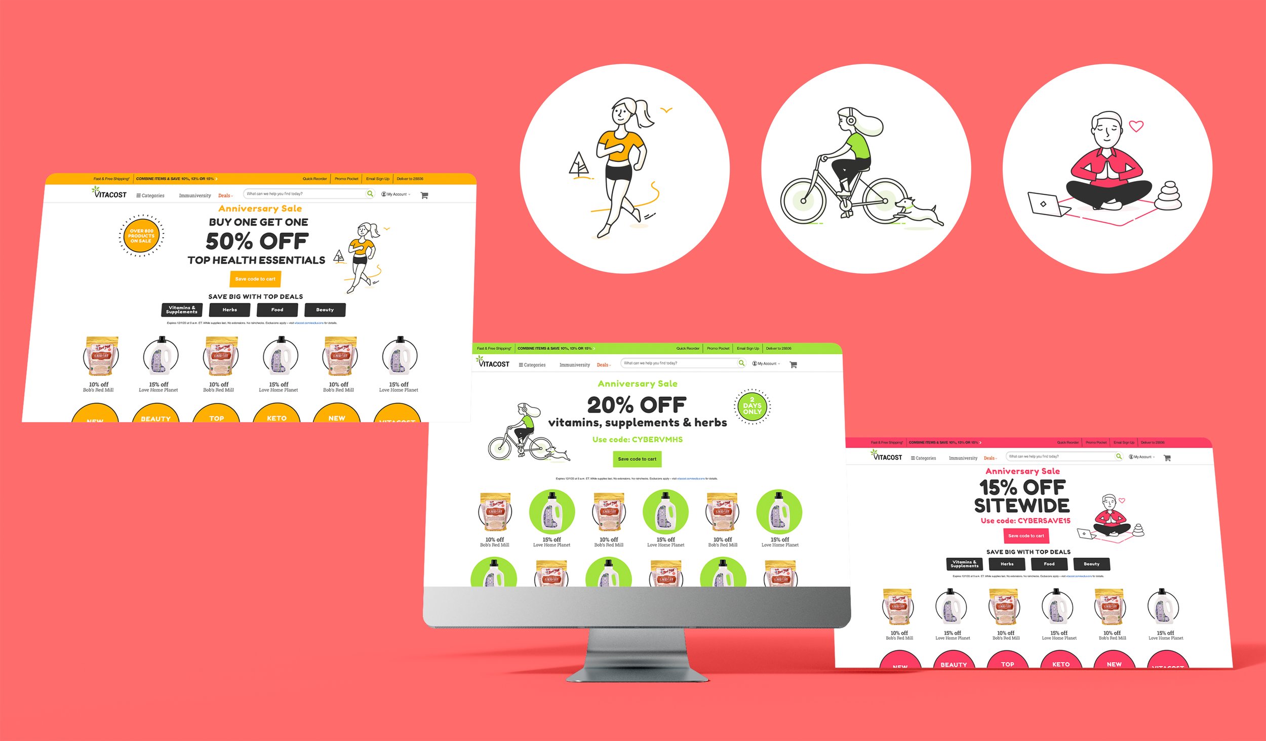
Below are two additional campaigns with distinct creative directions. One features products in a home setting, while the other uses illustrated characters to represent different areas of health and wellness. The product-focused campaign offered customers multiple ways to discover familiar brands at compelling discounts. In the second campaign, animation brought the illustrated characters to life across the homepage, creating a more engaging experience.
Additional Campaign Styling