Vitacost Brand Evolution
During my 12 years as a senior graphic designer at Vitacost, I played a significant role in the growth and evolution of the company’s brand. Through thoughtful design and close collaboration with photographers and copywriters, I helped transform a loosely defined visual presence into a more elevated, cohesive, and recognizable identity.
Brand Guide
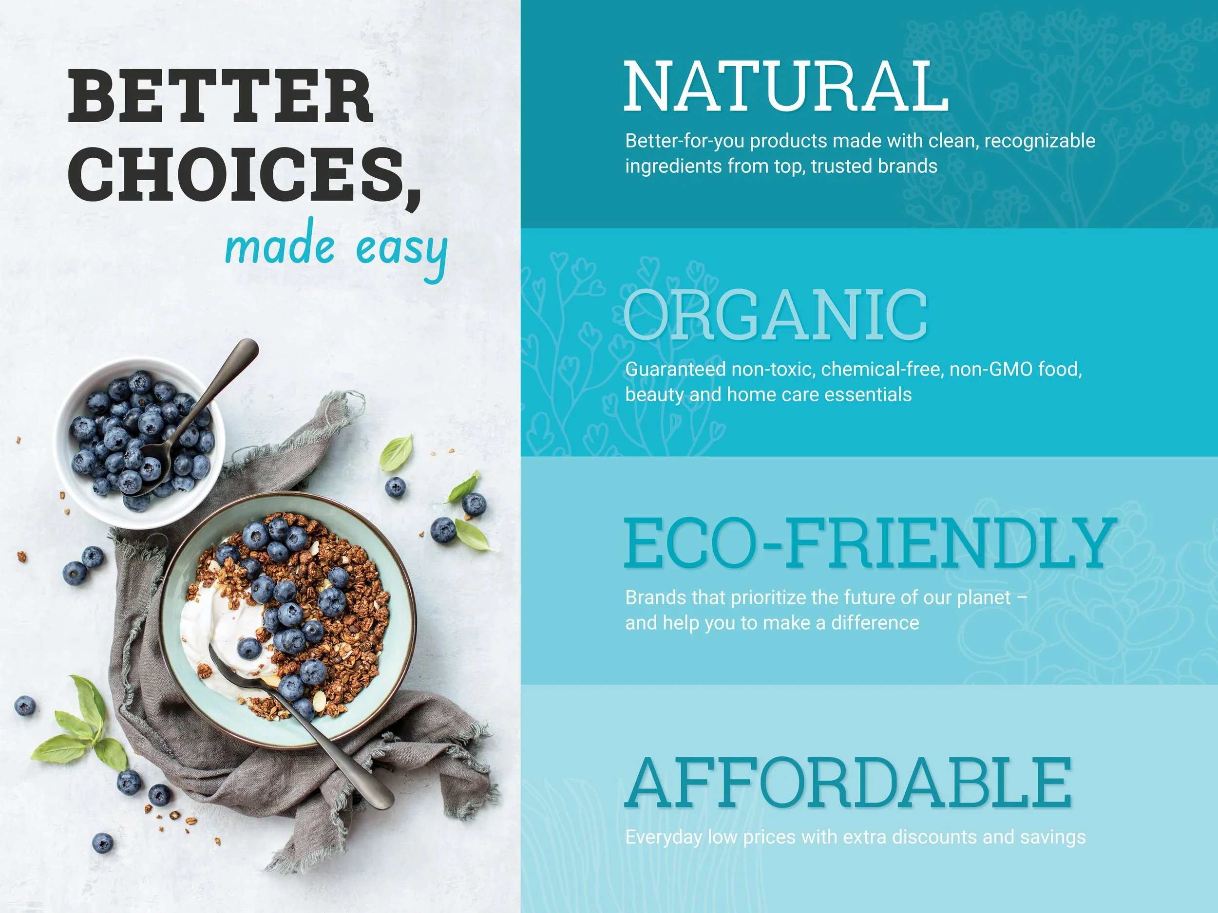
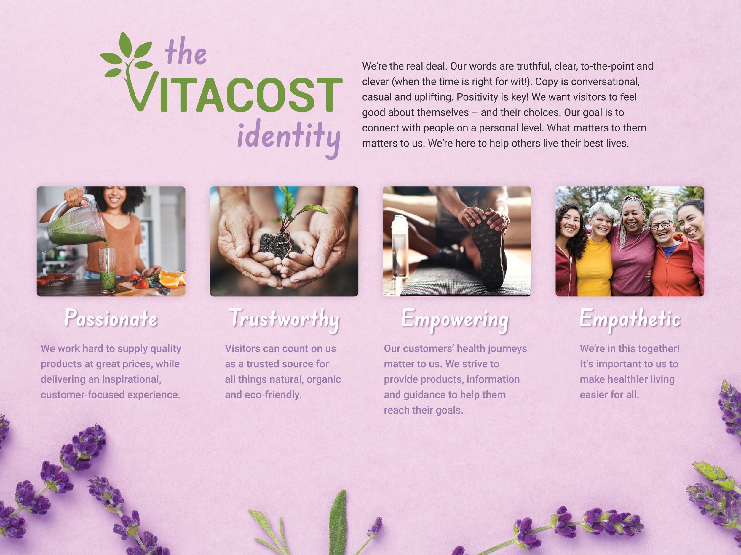
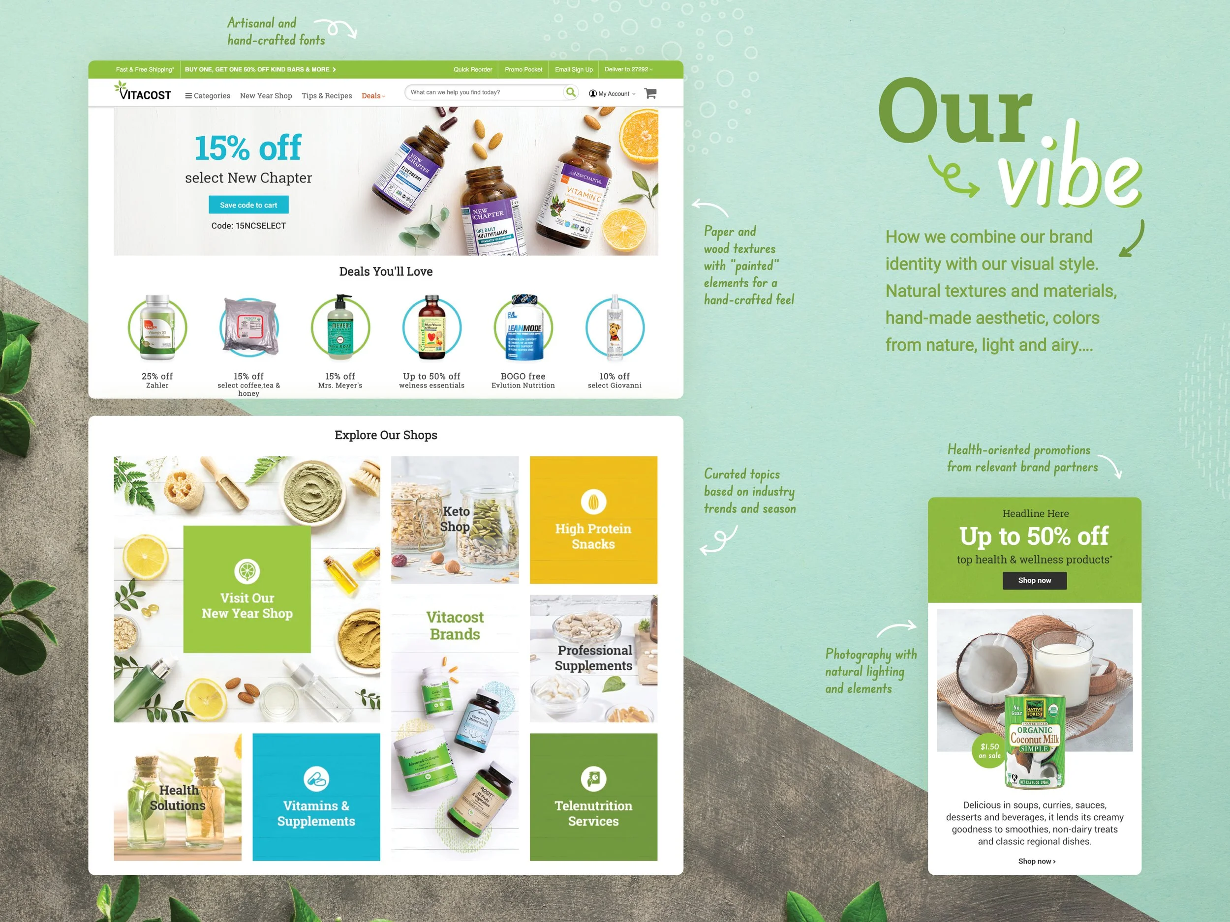
I created this brand guide to define Vitacost’s overall identity, including its visual style, tone, and personality. It brought the company’s mission, values, goals, and design standards together in one comprehensive resource. The guide provided direction for internal teams and could also be shared with external promotional partners.


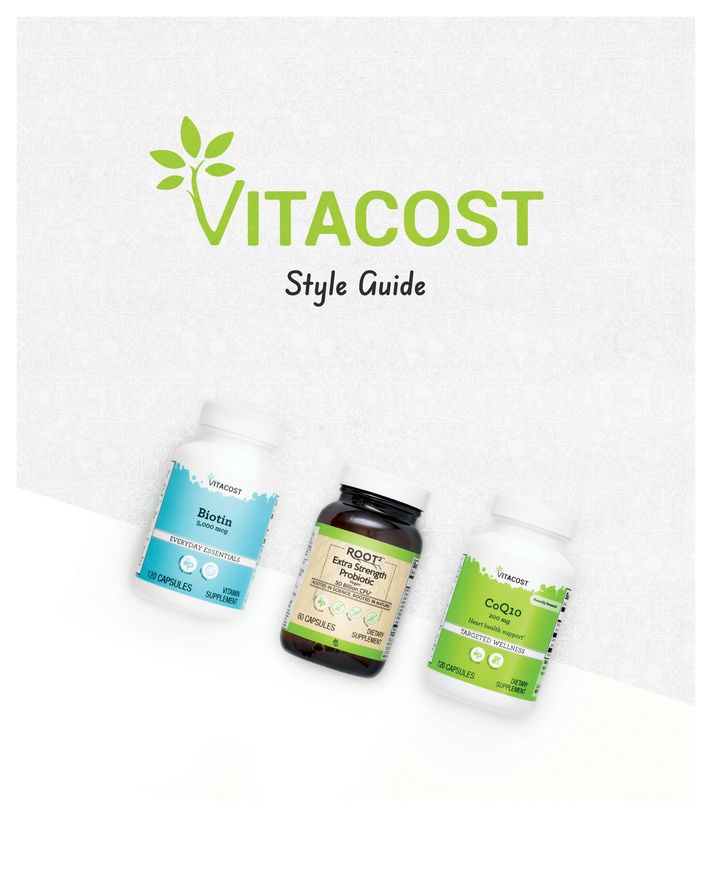
Style Guide
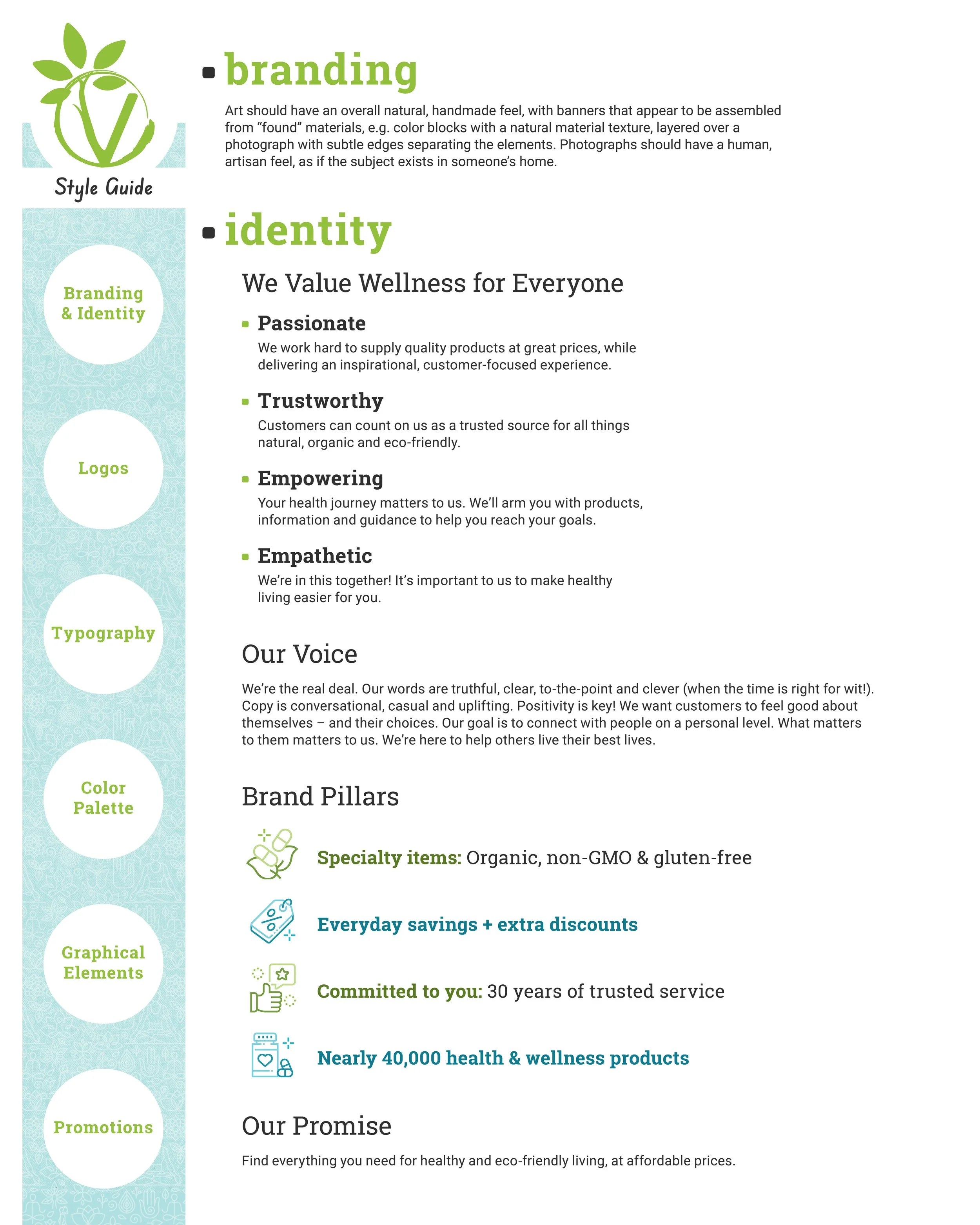
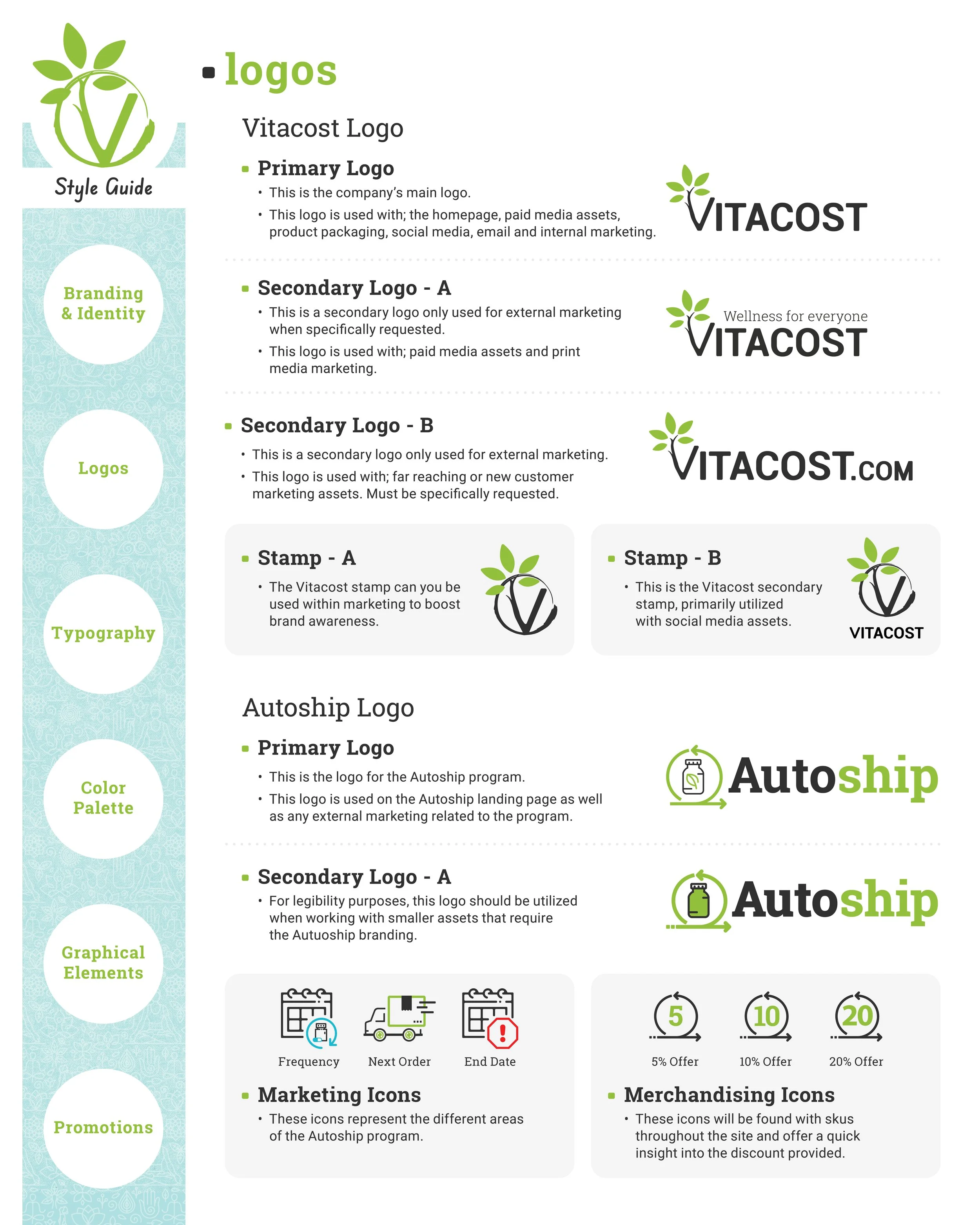
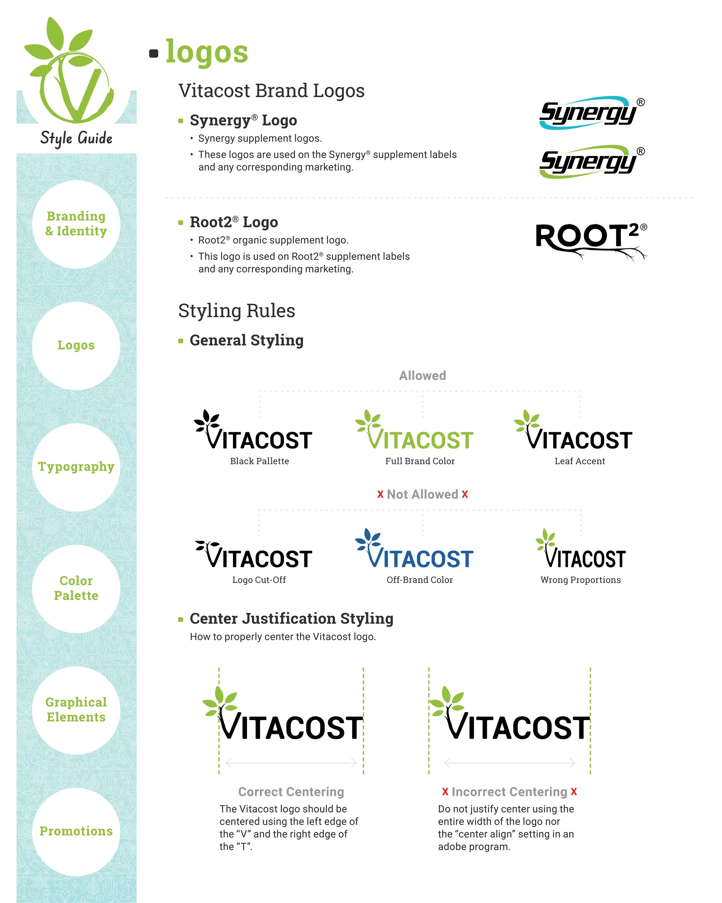
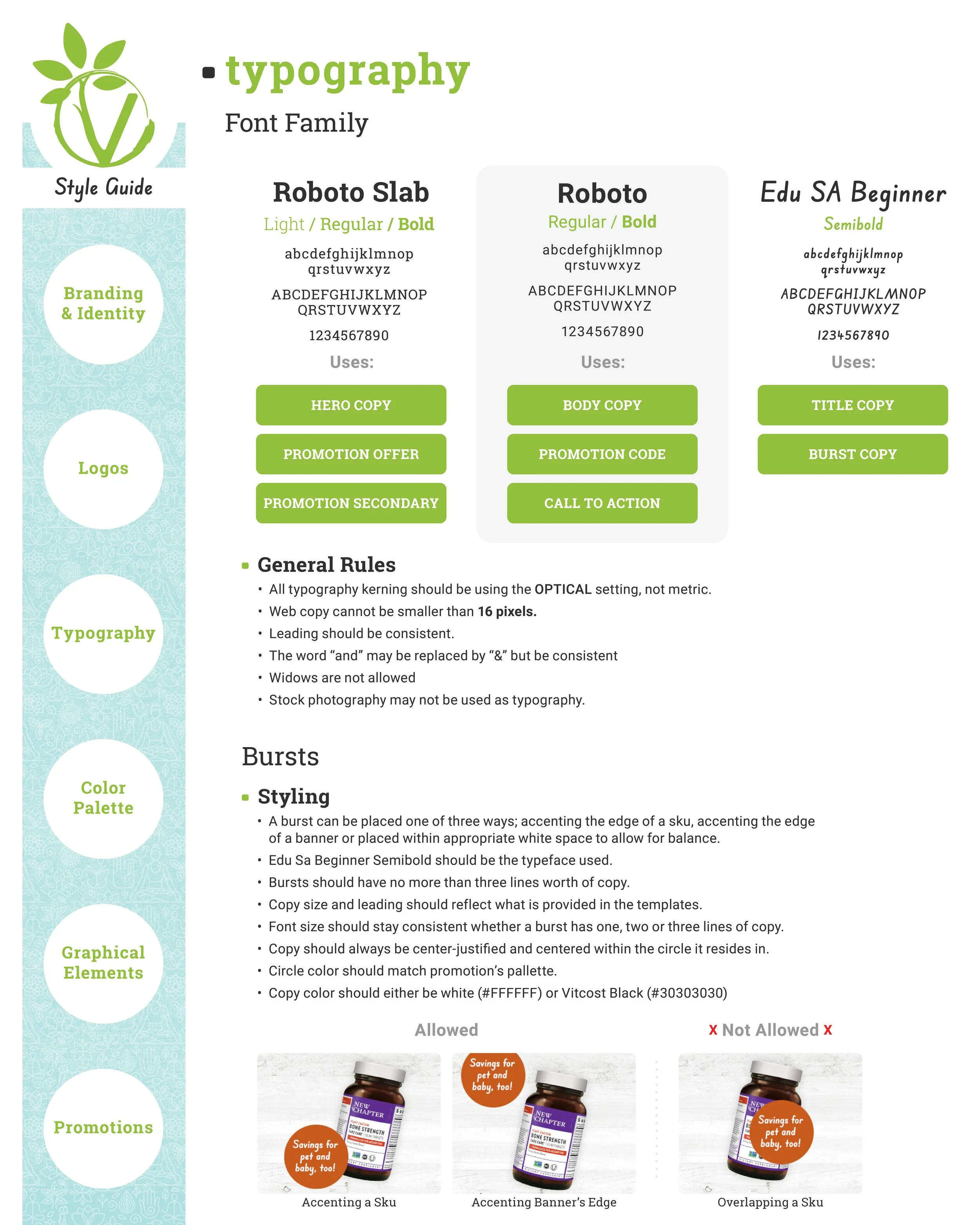
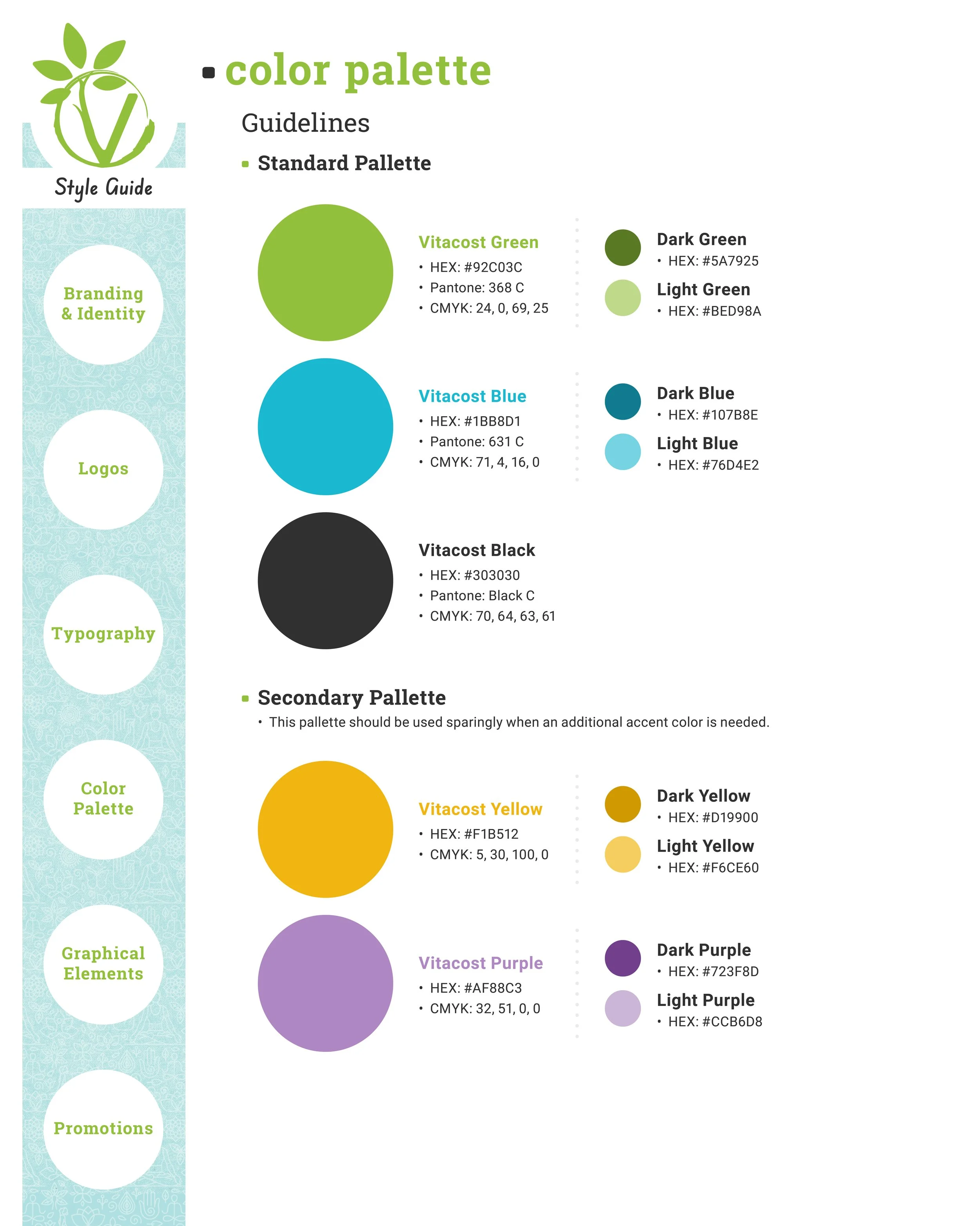
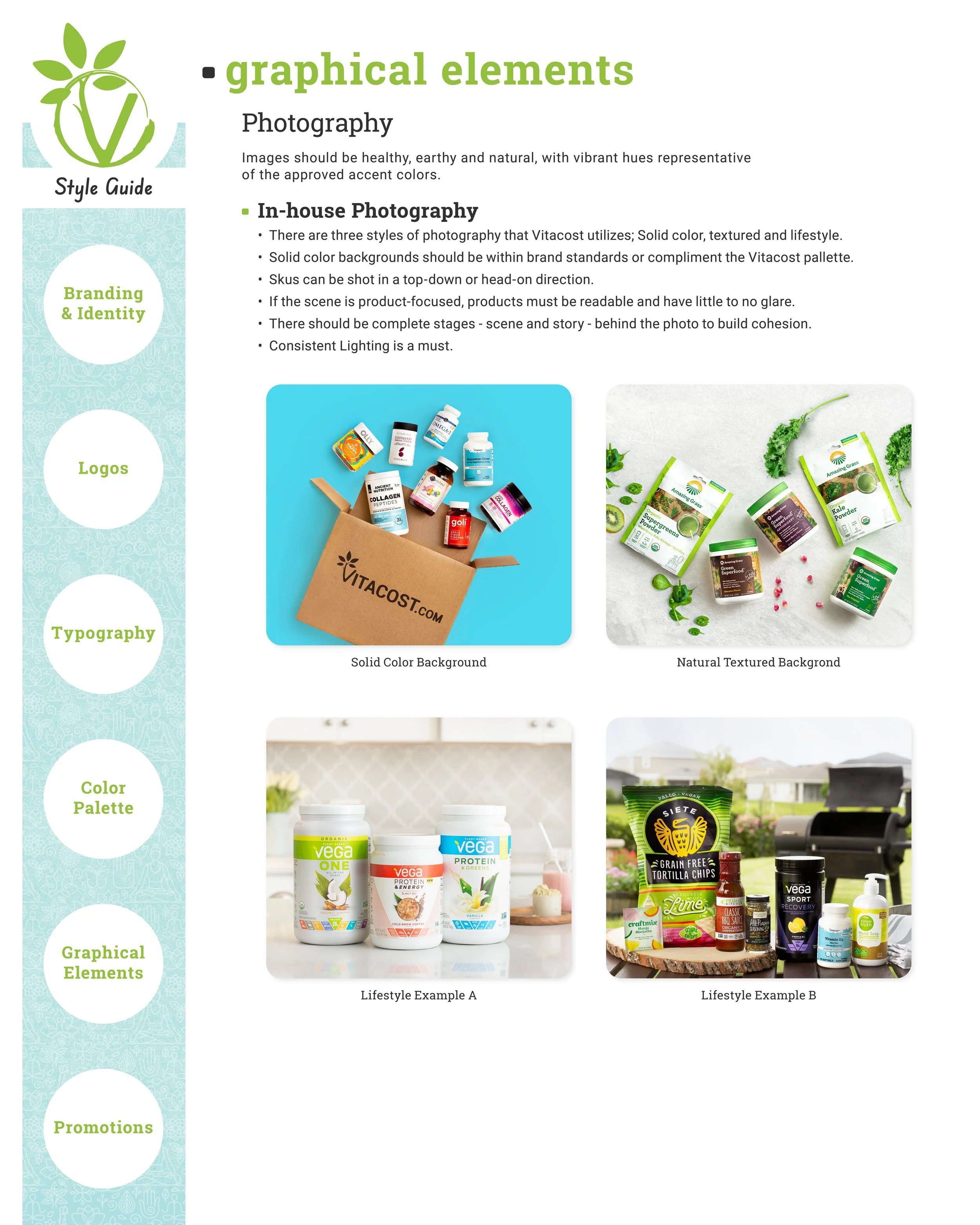
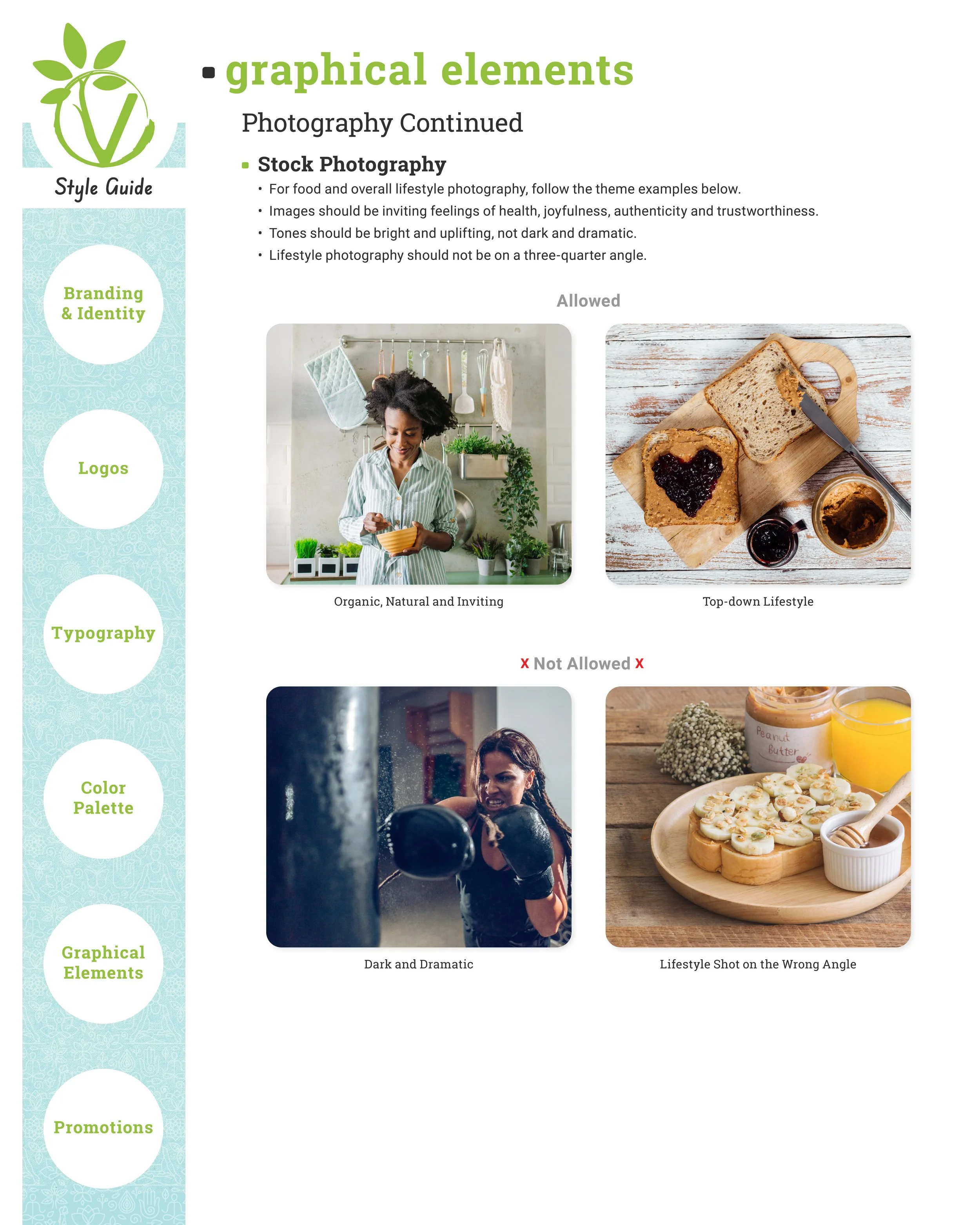
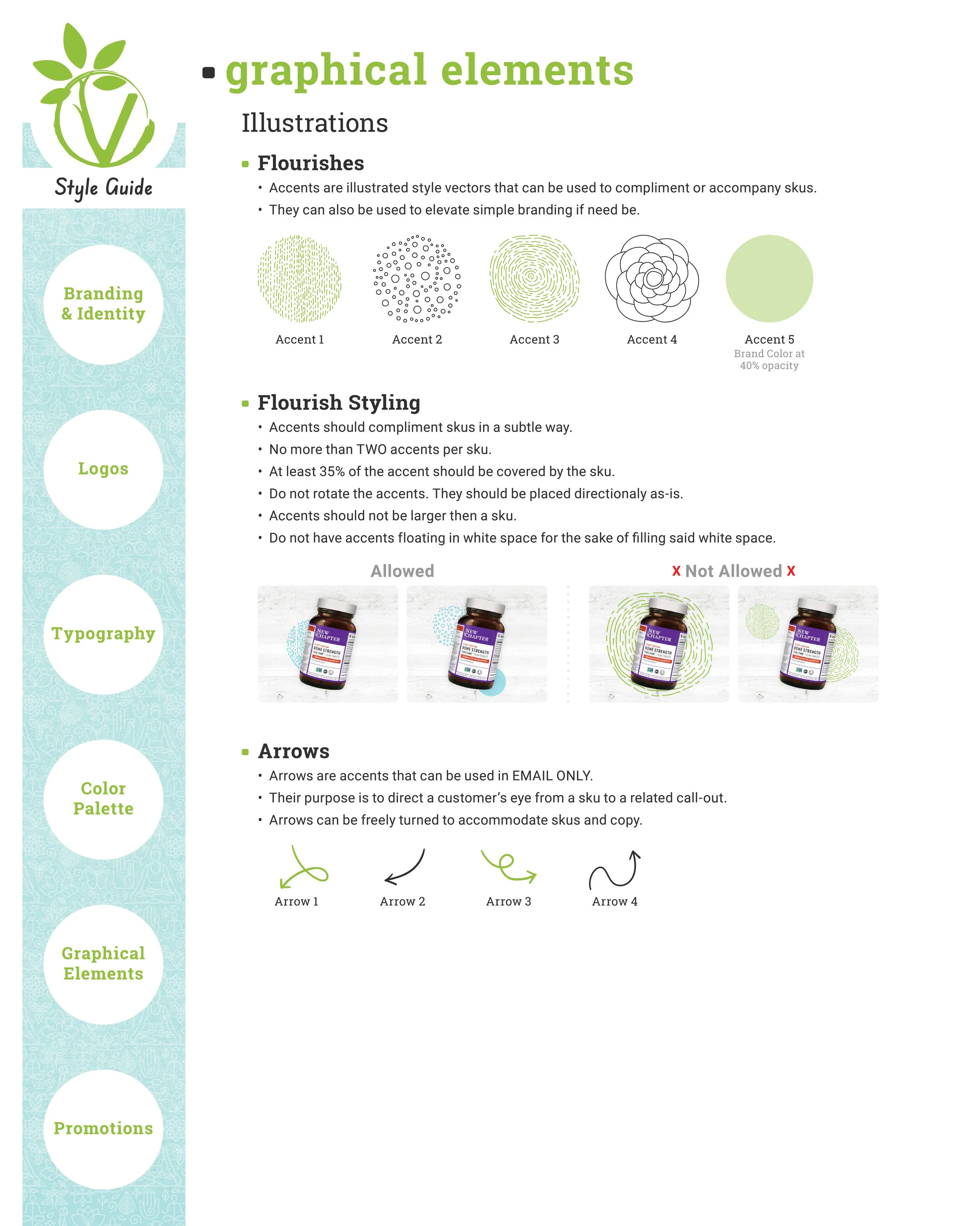
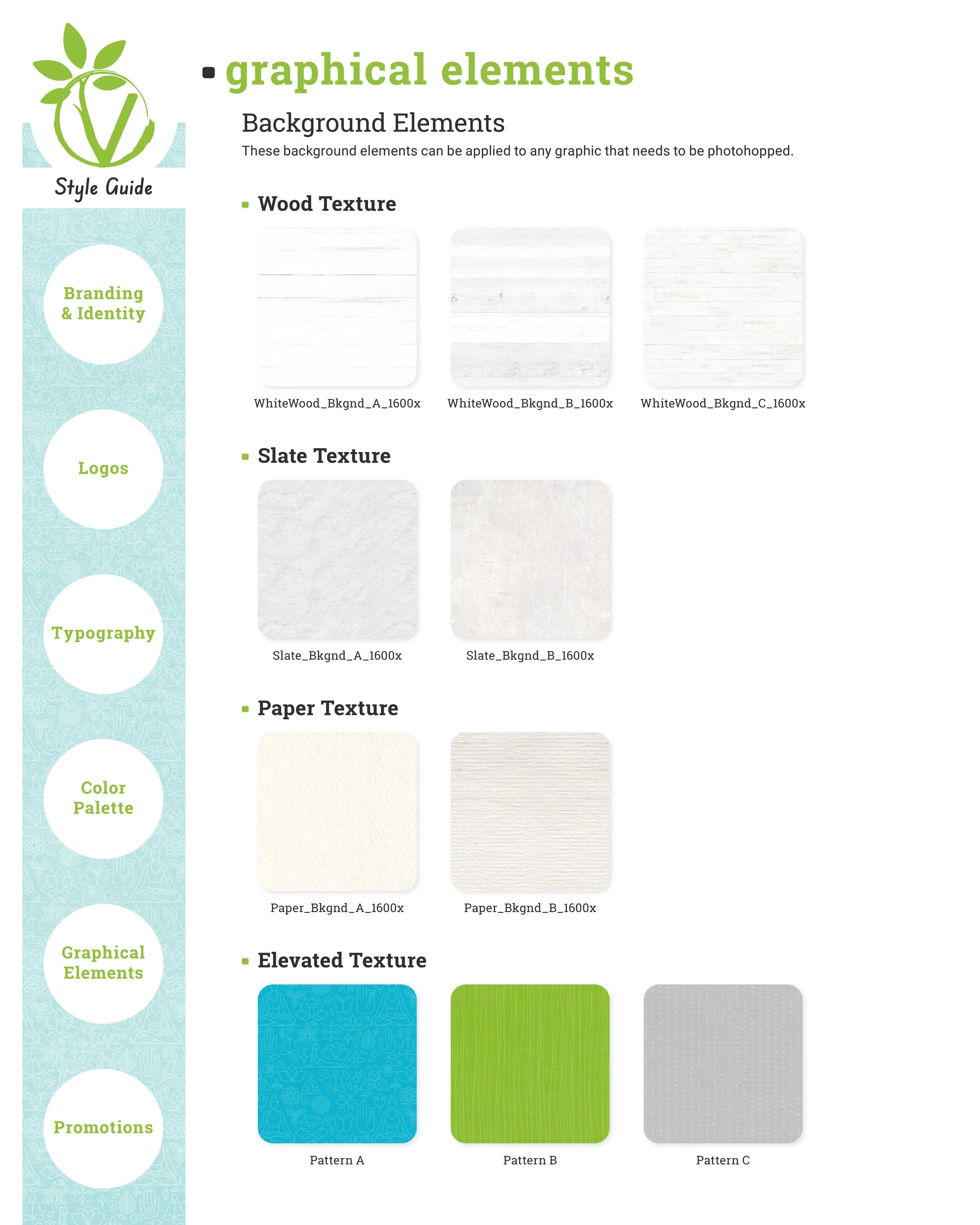
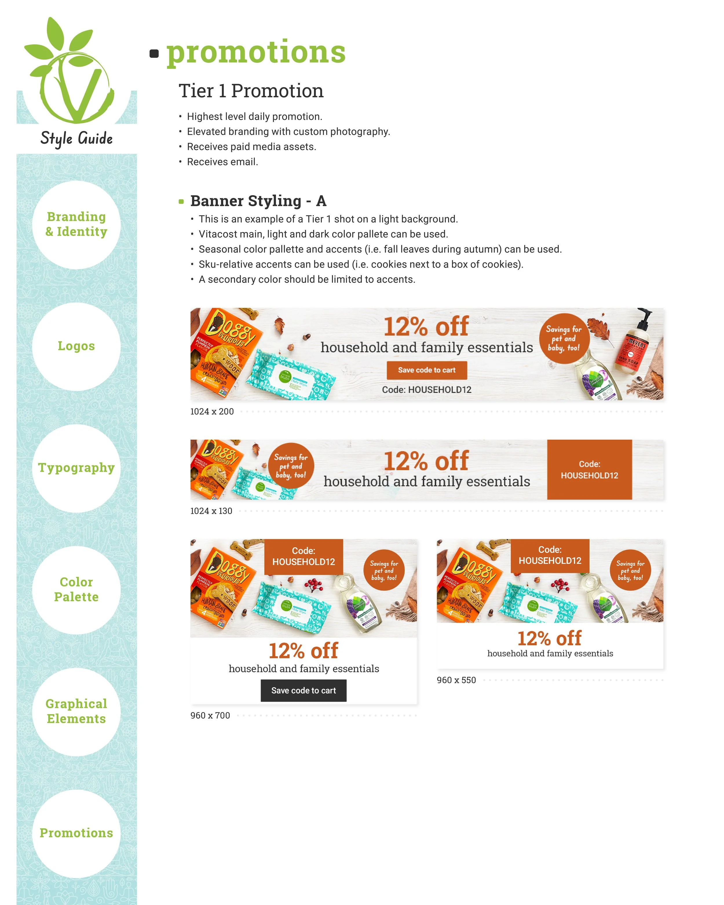
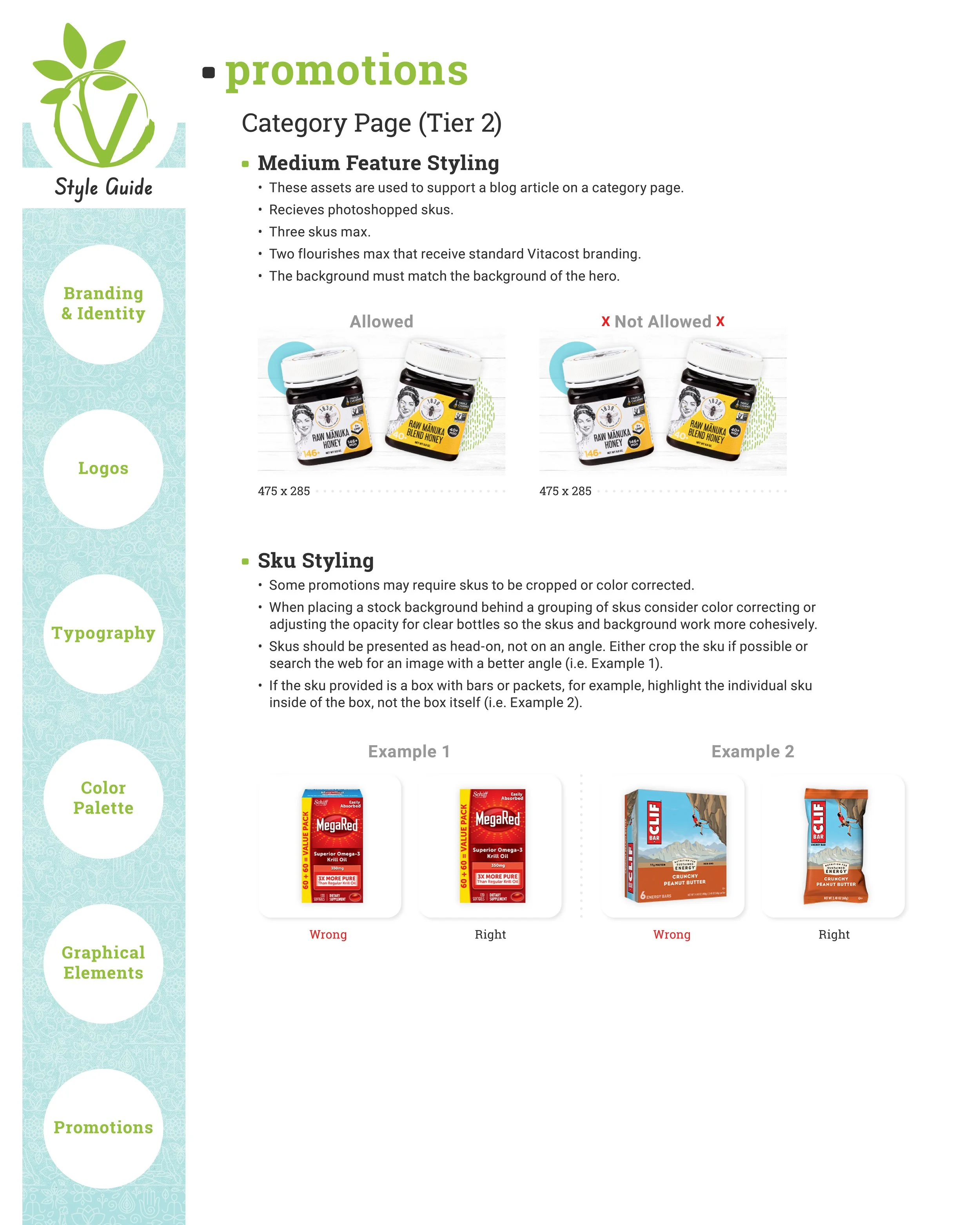
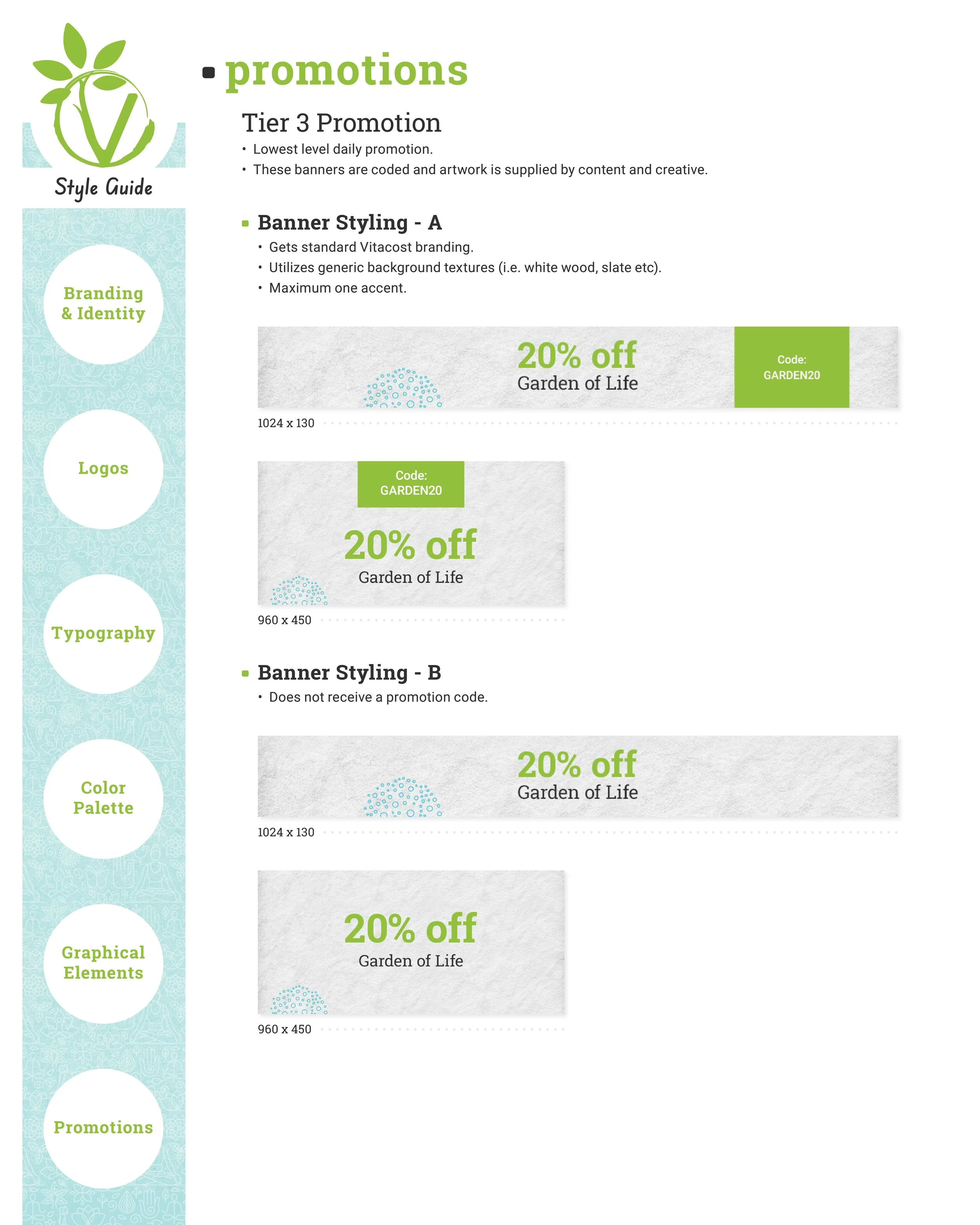
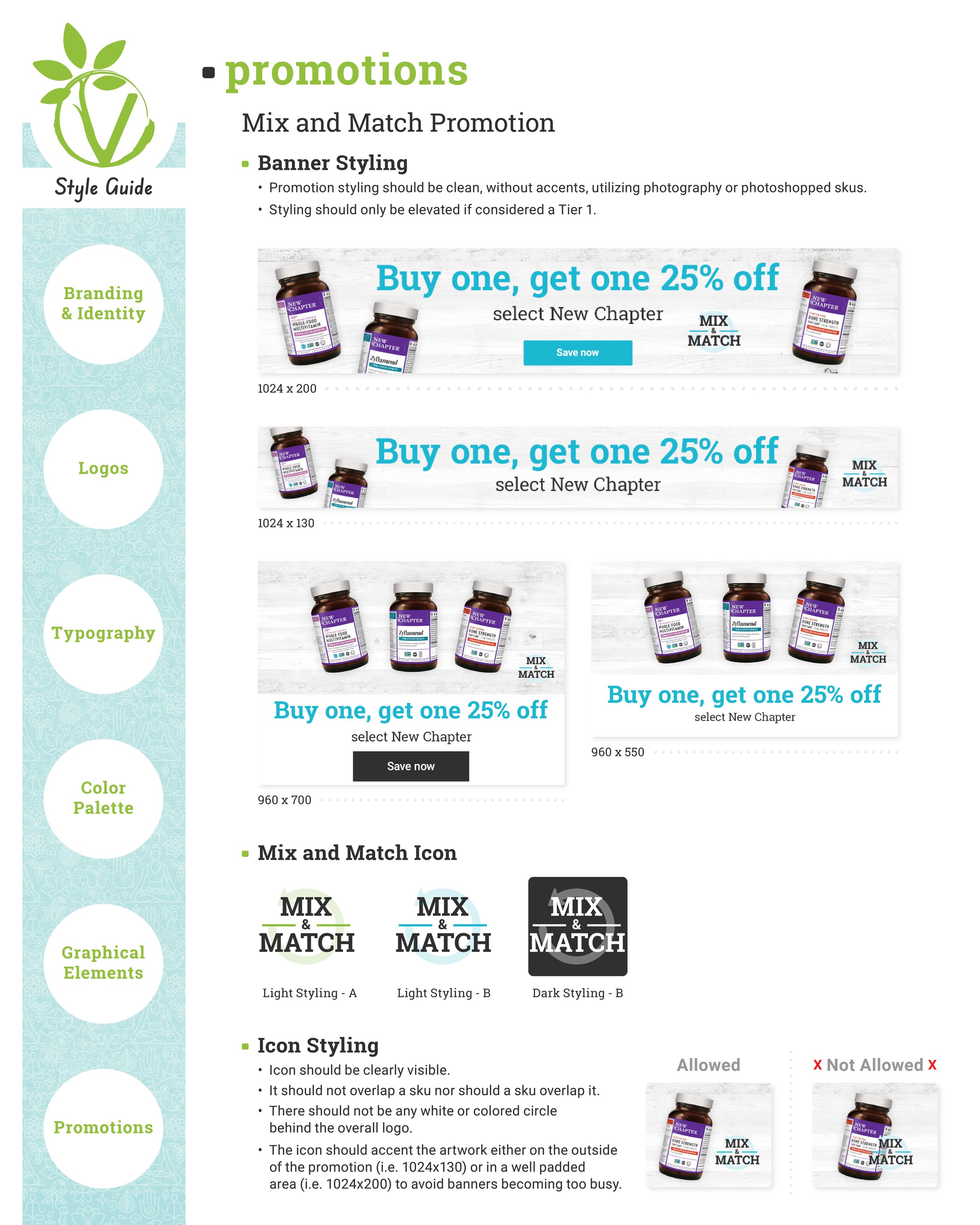
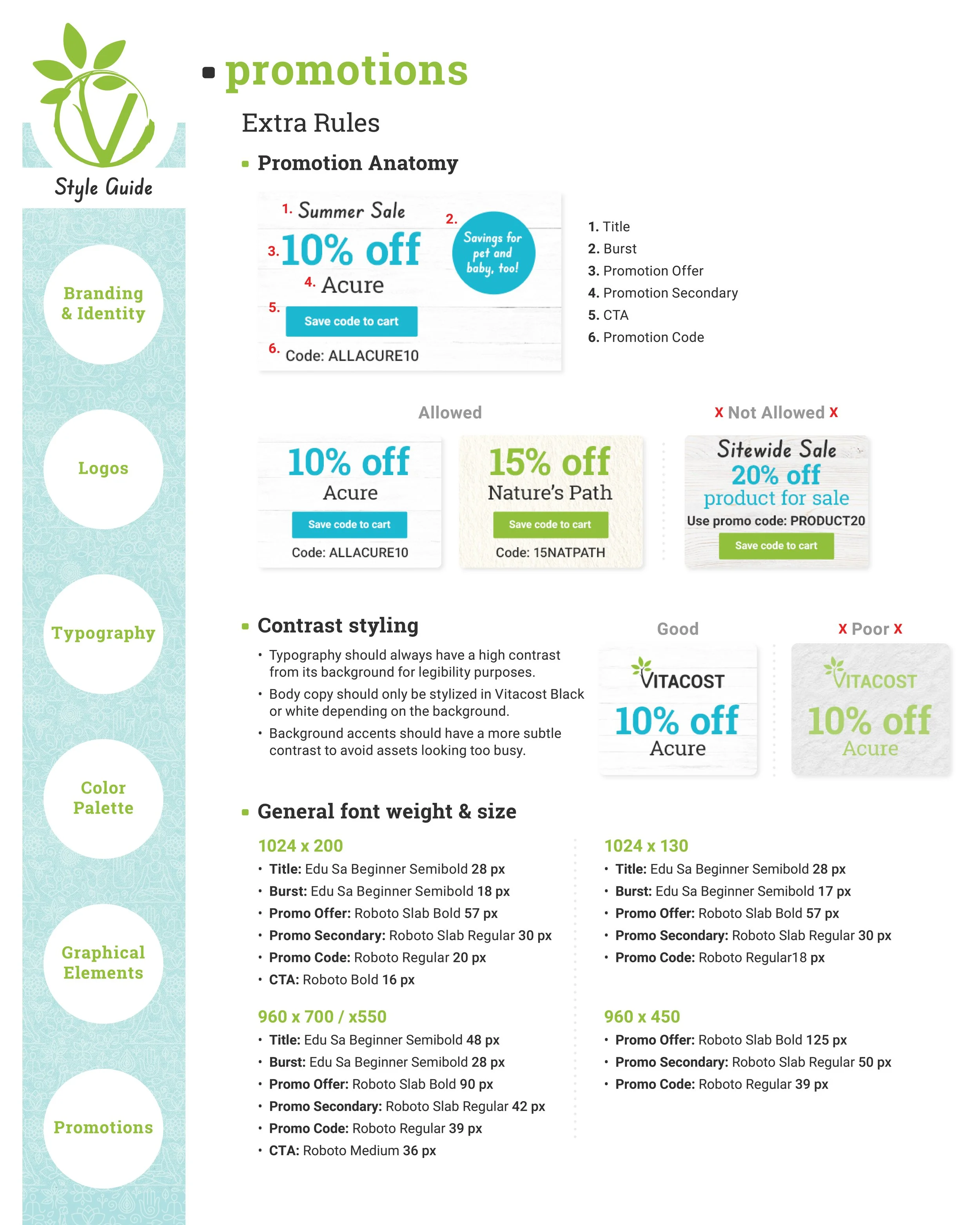
I created this style guide to document the technical standards governing the brand’s visual identity. It covers design principles, logo placement, photography direction, color palettes, promotional asset specifications, and additional applications. Explore the complete guide below.
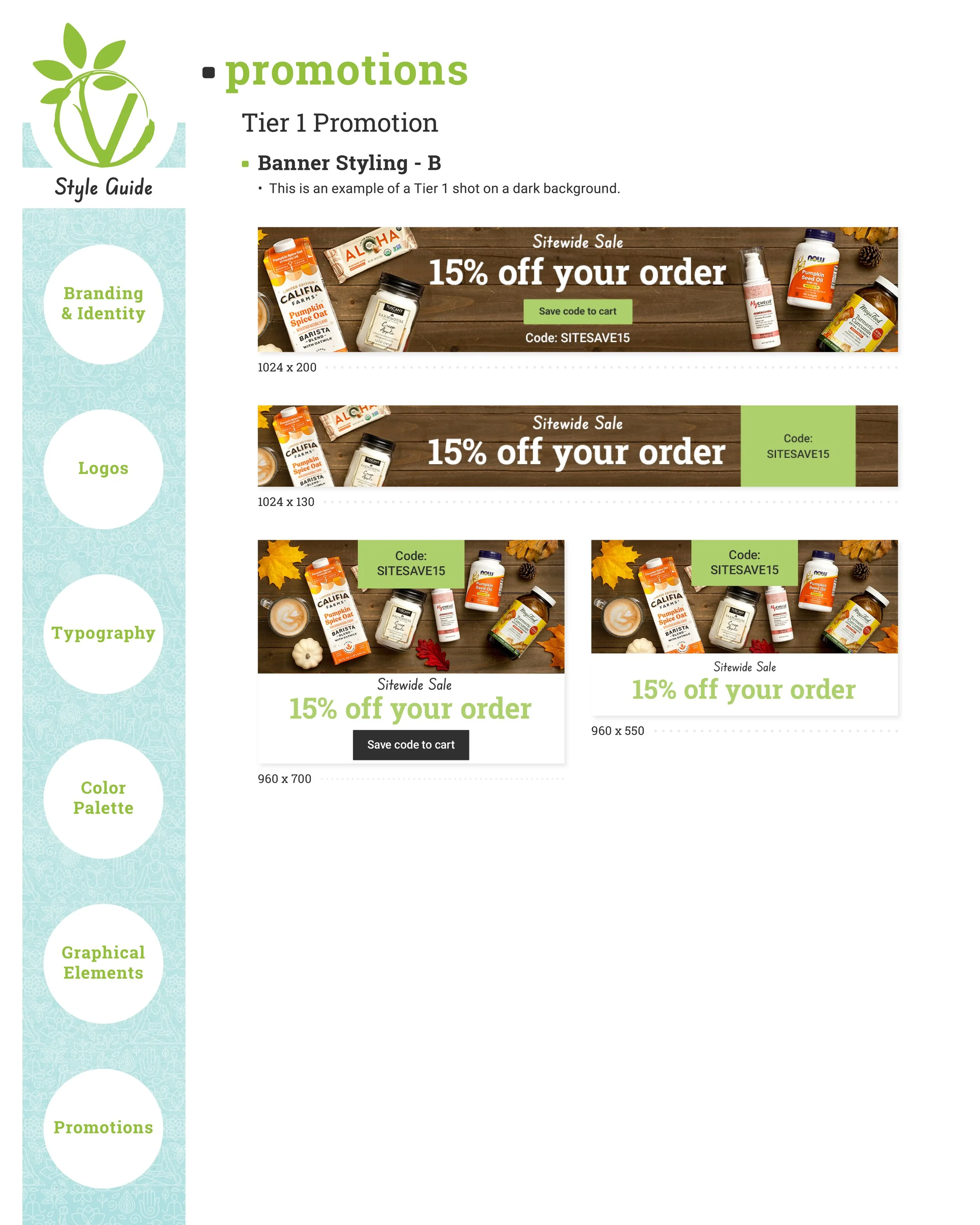
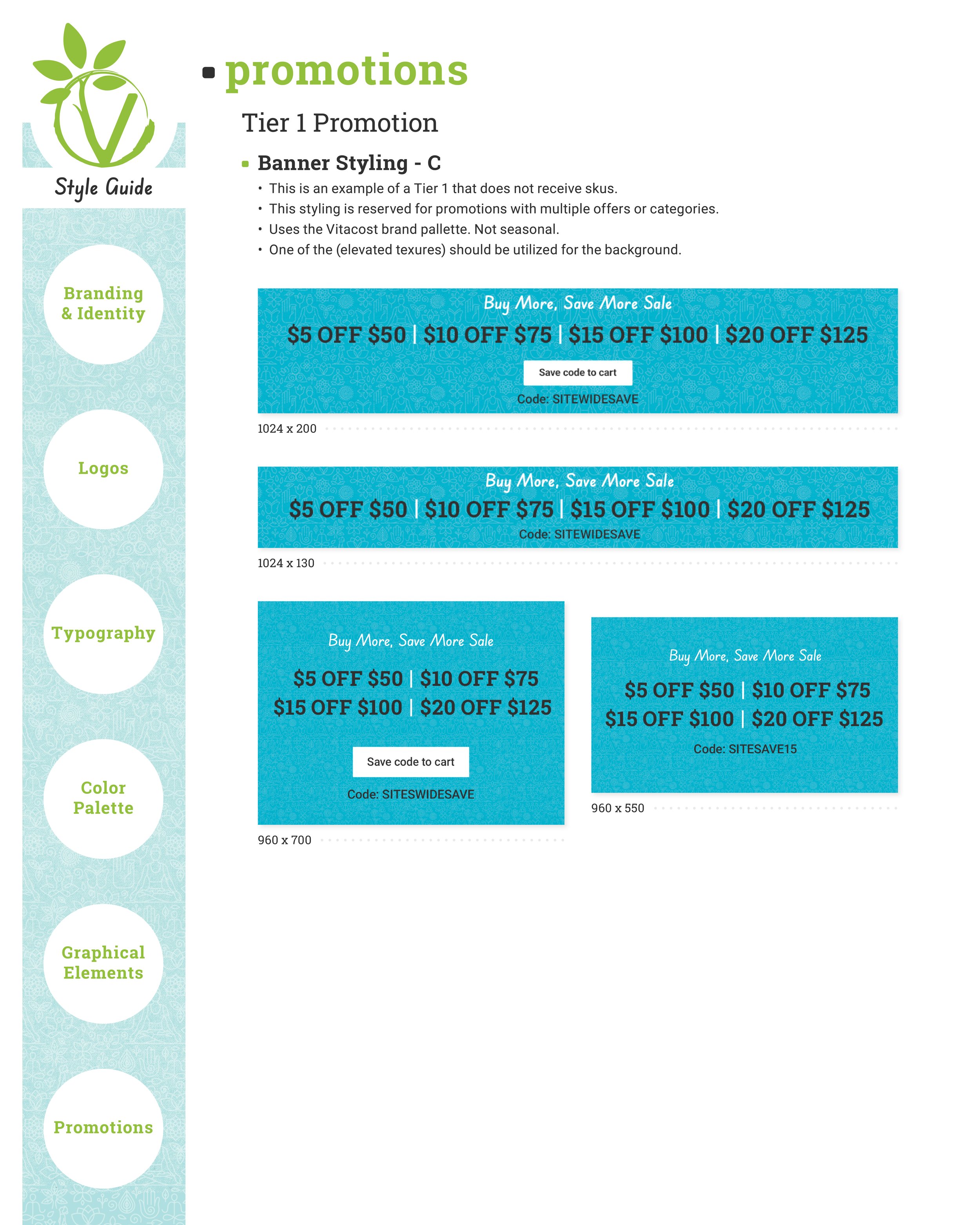
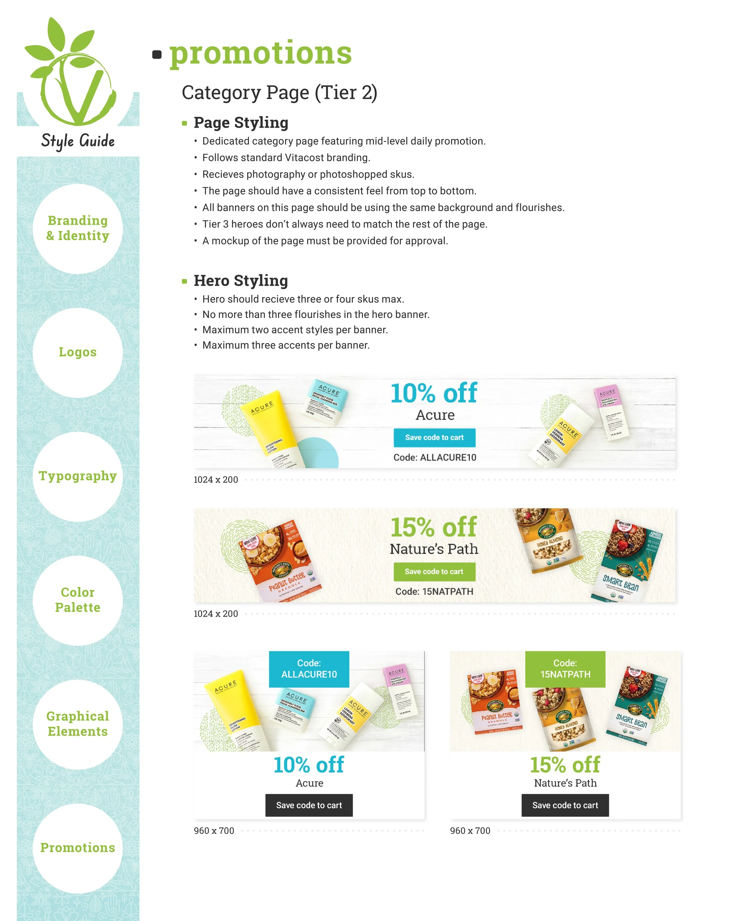
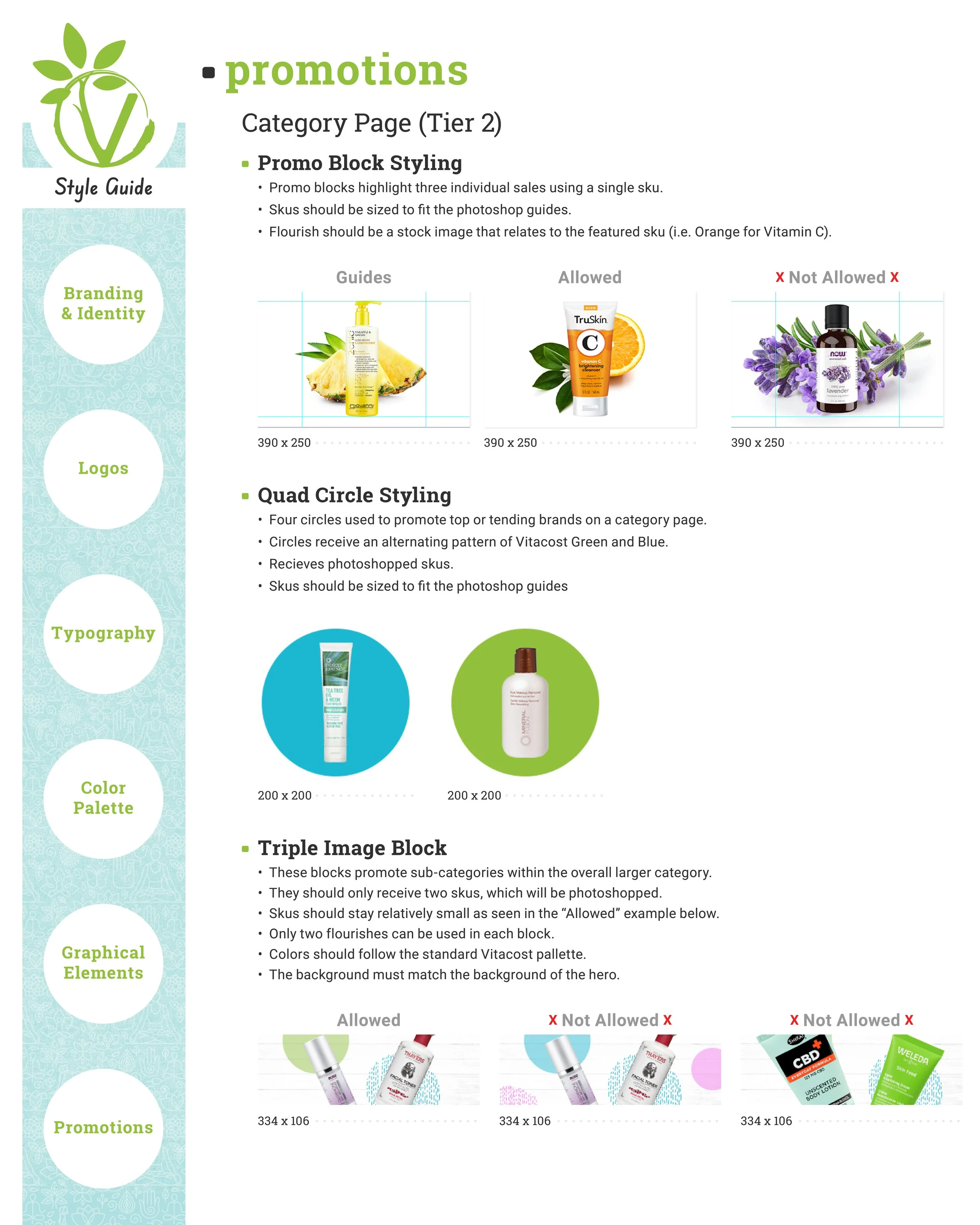
Promotion Style Evolution
This section explores the evolution of the brand and the role I played in shaping its development.
Style - Phase 1
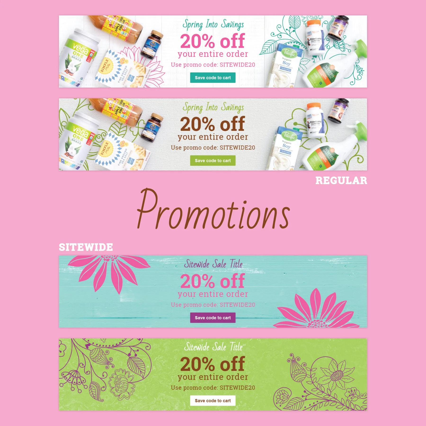
Before Vitacost established a unified brand system, each promotion had its own theme-driven identity. I combined product images with natural and organic photography to create engaging, story-driven campaigns.


Style - Phase 2
This approach evolved alongside Vitacost’s broader brand transformation and helped define its final visual identity. The flat-lay photography and organic textures were adapted from VitaVibes, the print magazine for which I served as art director and lead designer. Subject-specific imagery and consistent layouts created a more cohesive marketing presence.


Style - Phase 3
This final phase of the brand’s evolution fully embraced Vitacost’s established visual identity, incorporating custom flat-lay product photography and lifestyle imagery. Building on the foundation of phase two, the refined approach gave the brand a more polished, cohesive, and trustworthy presence.


Legacy Brand Guides
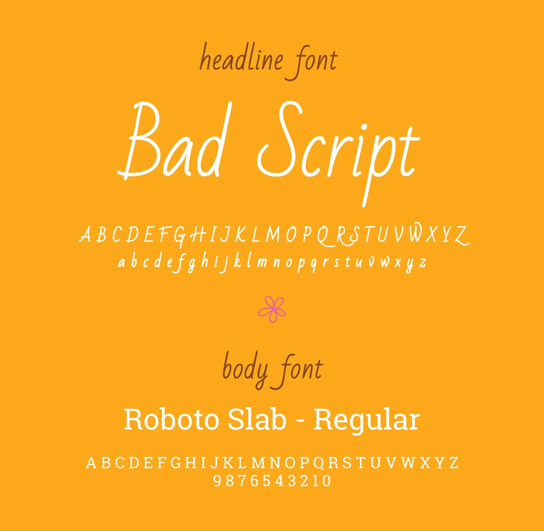
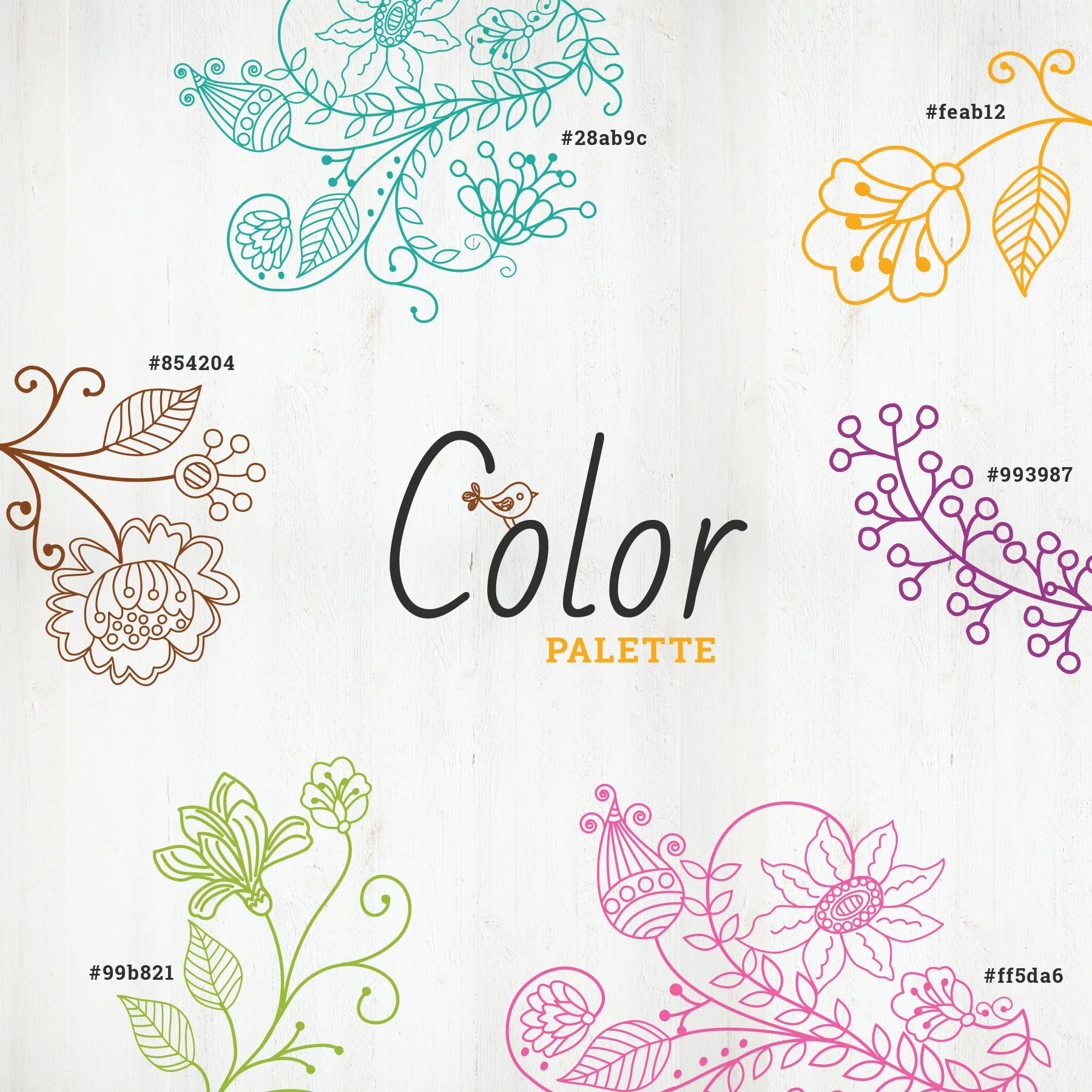
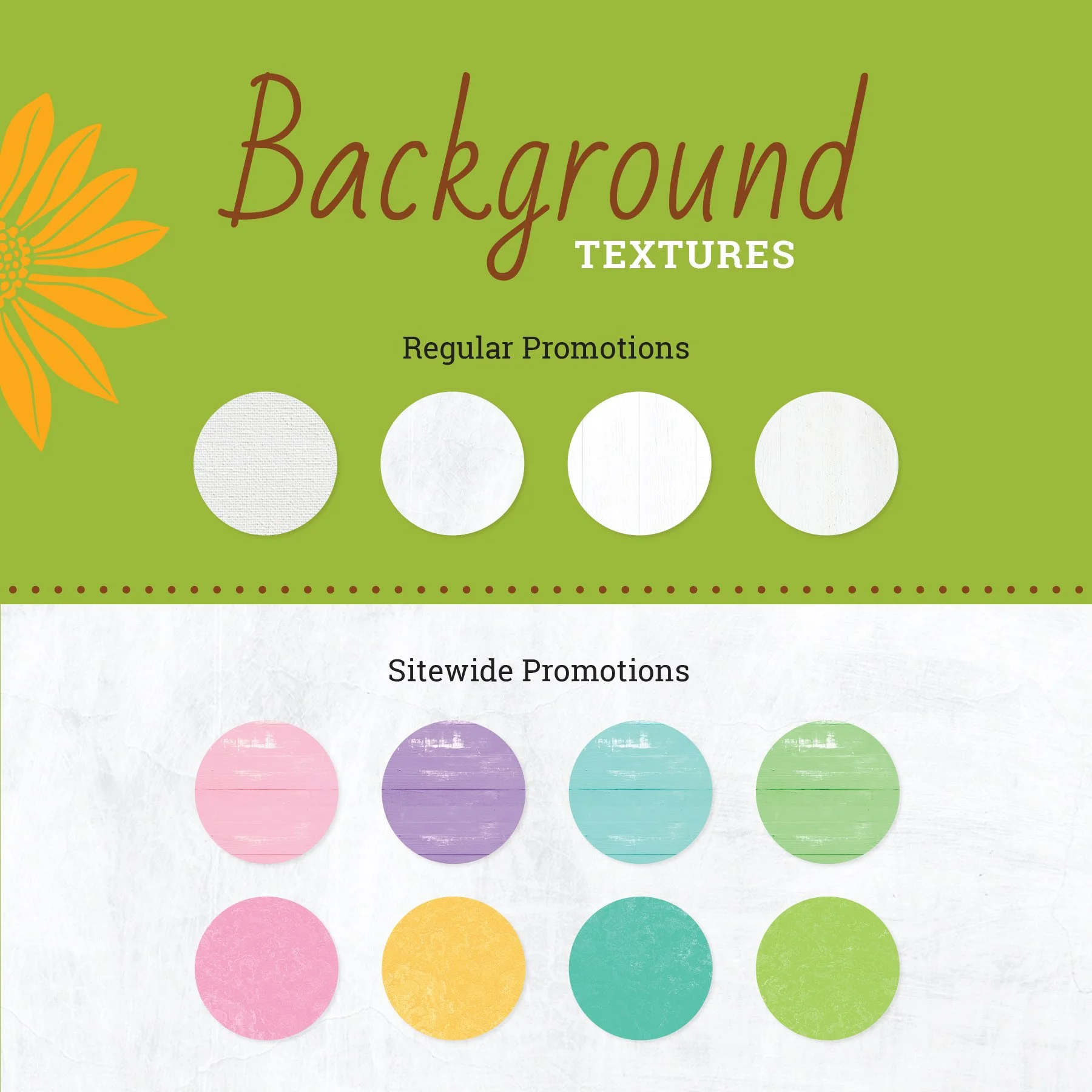
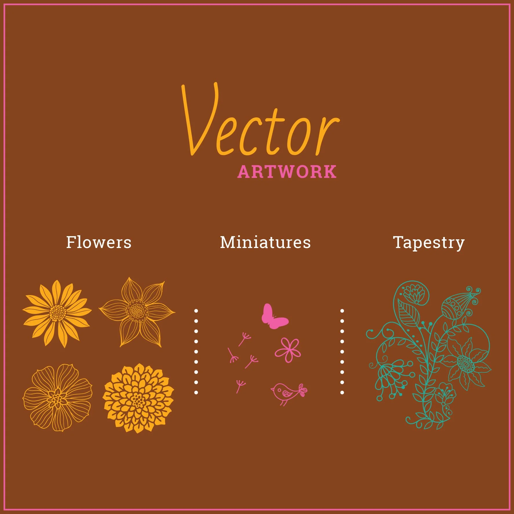
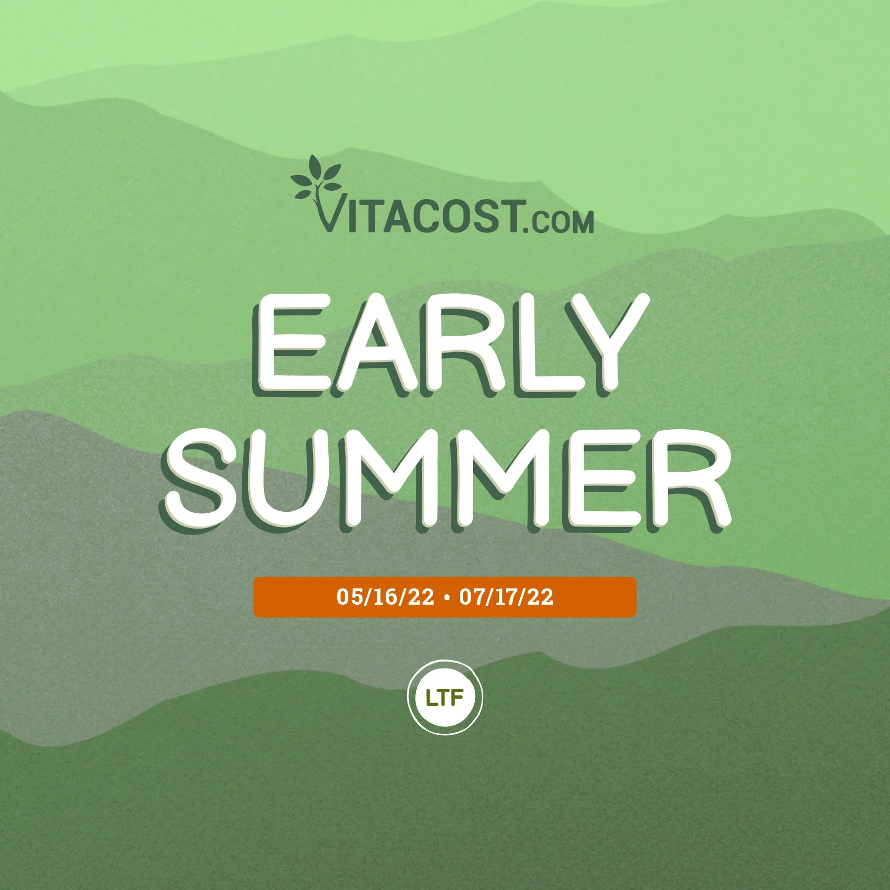
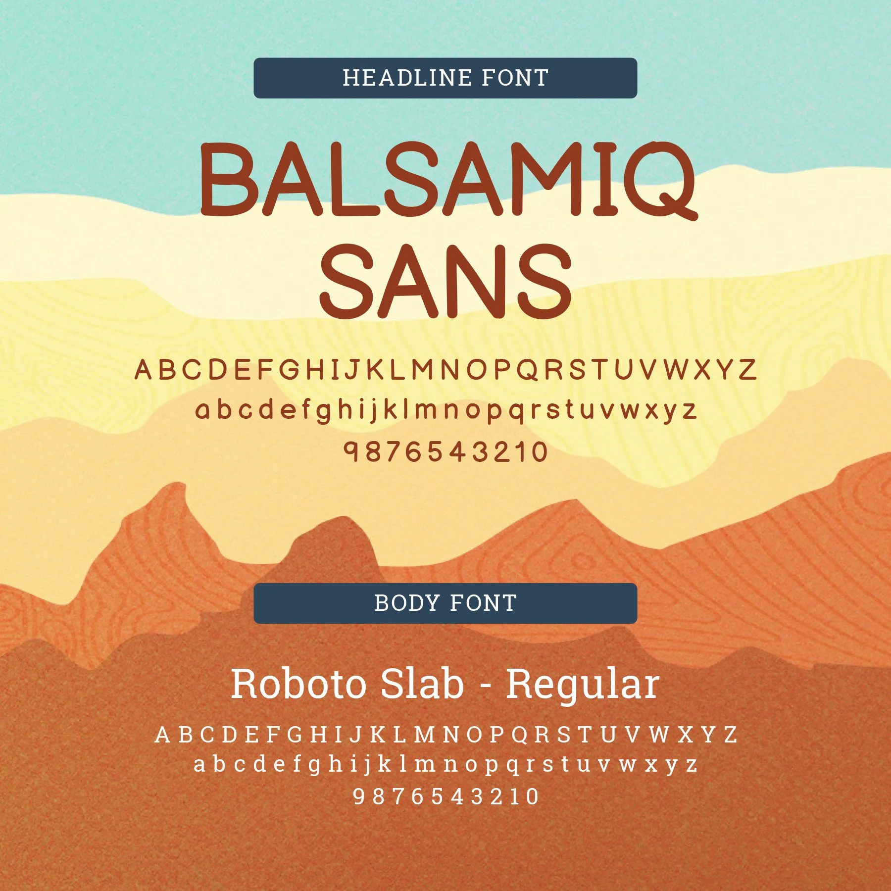
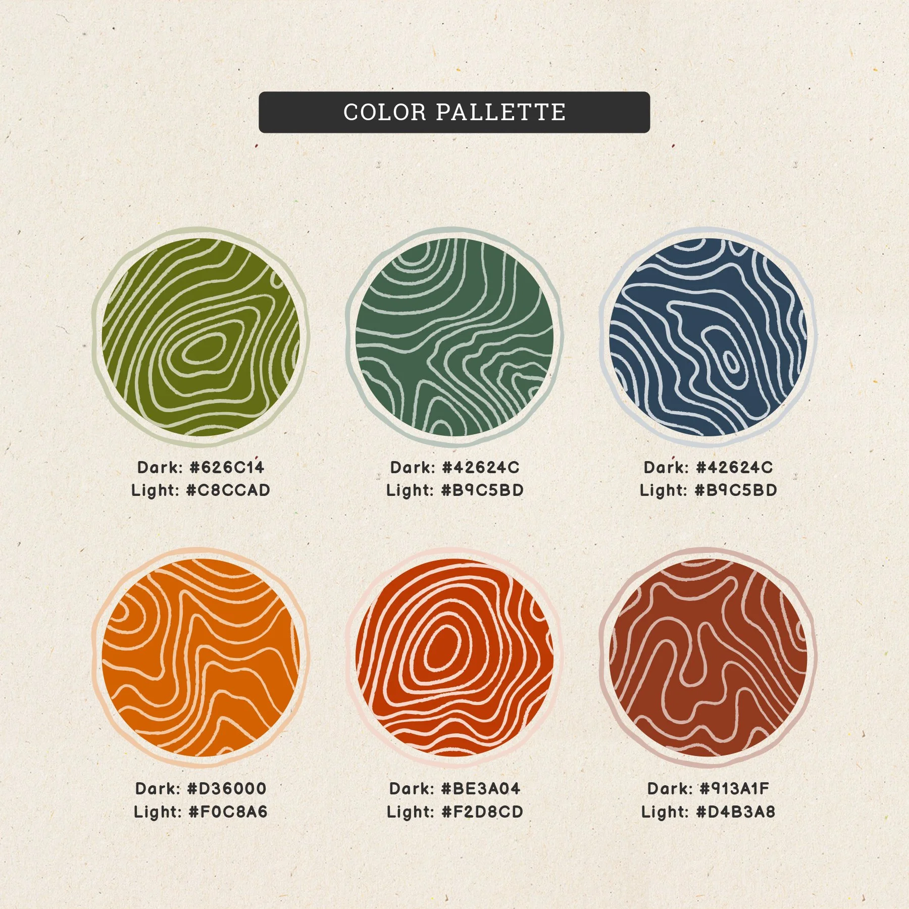
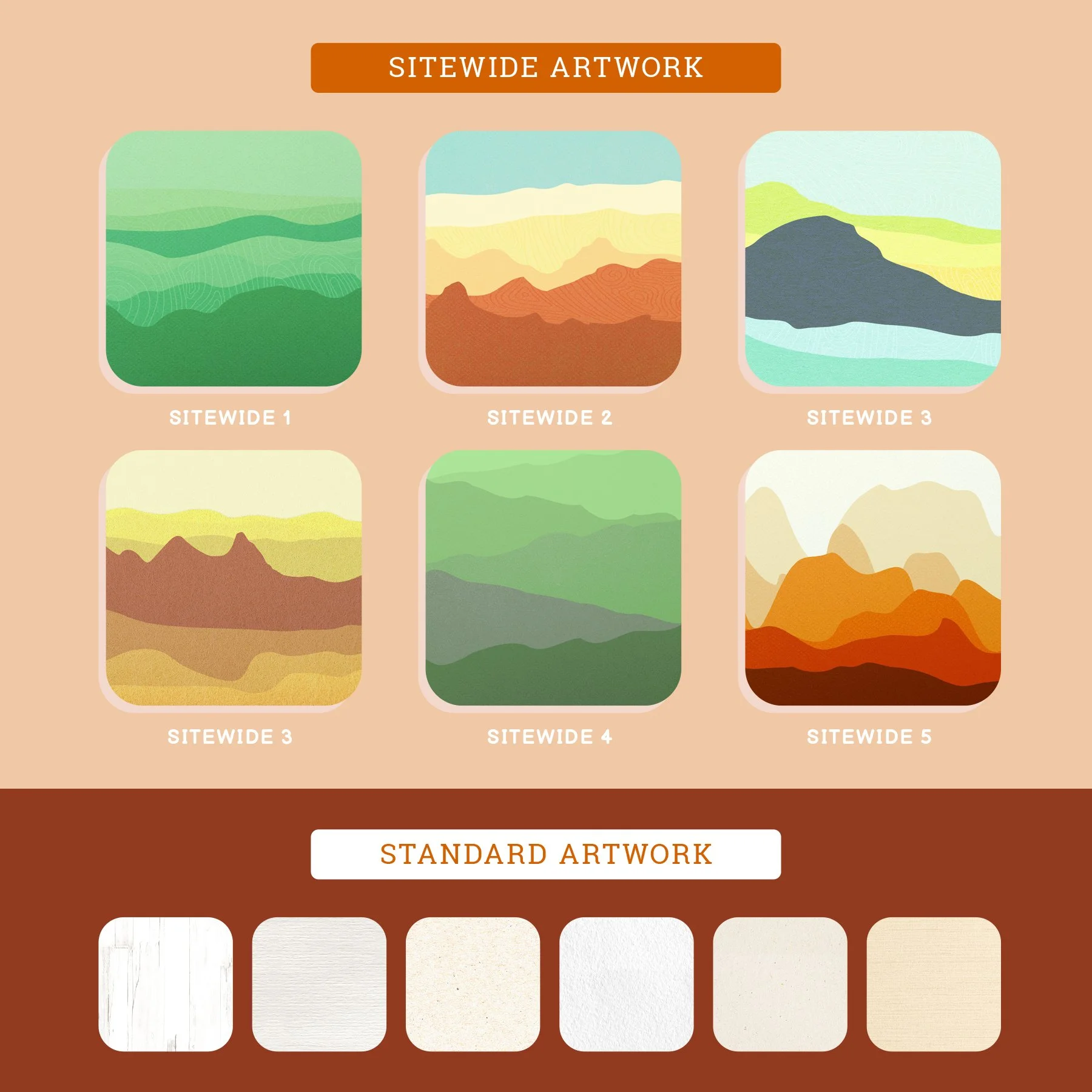
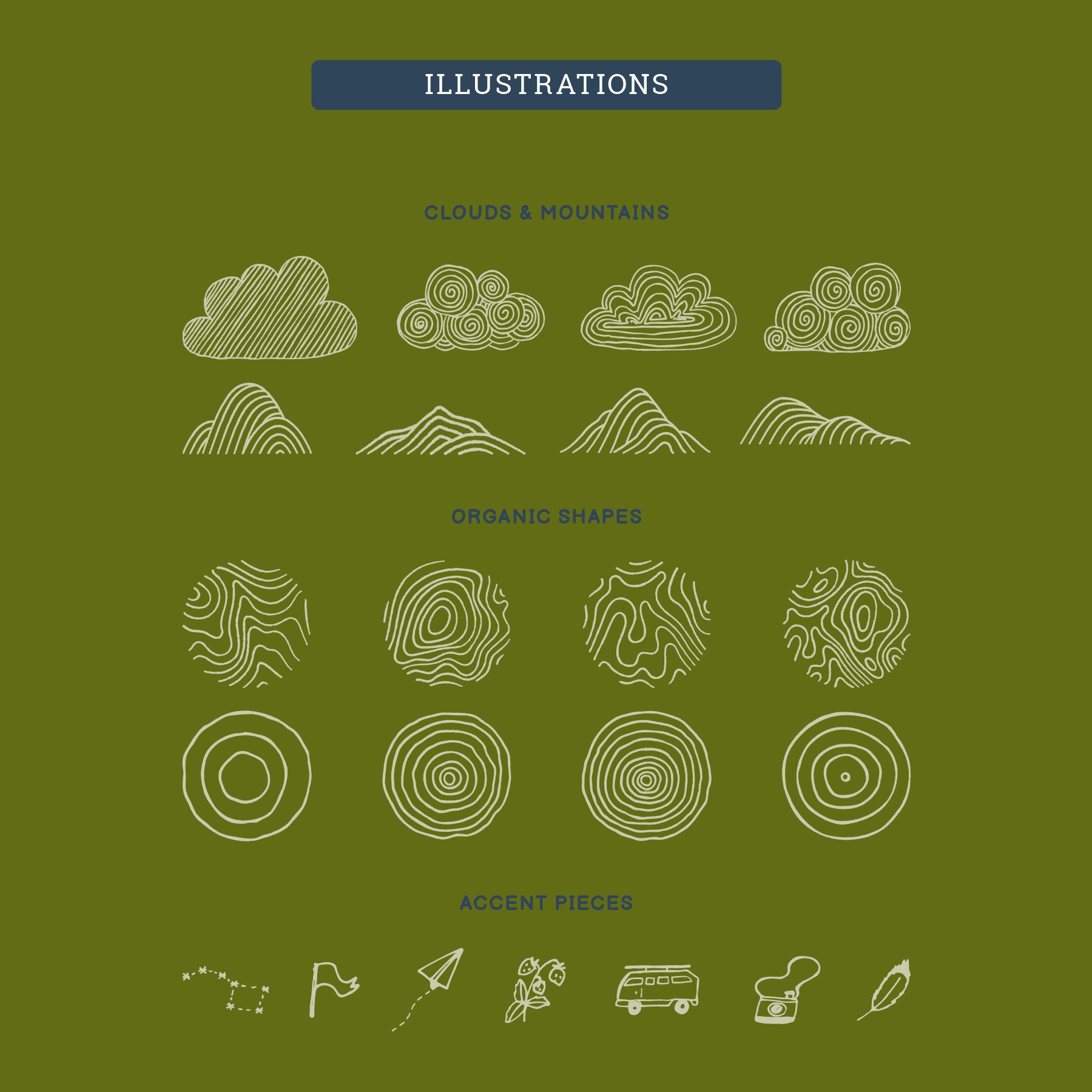
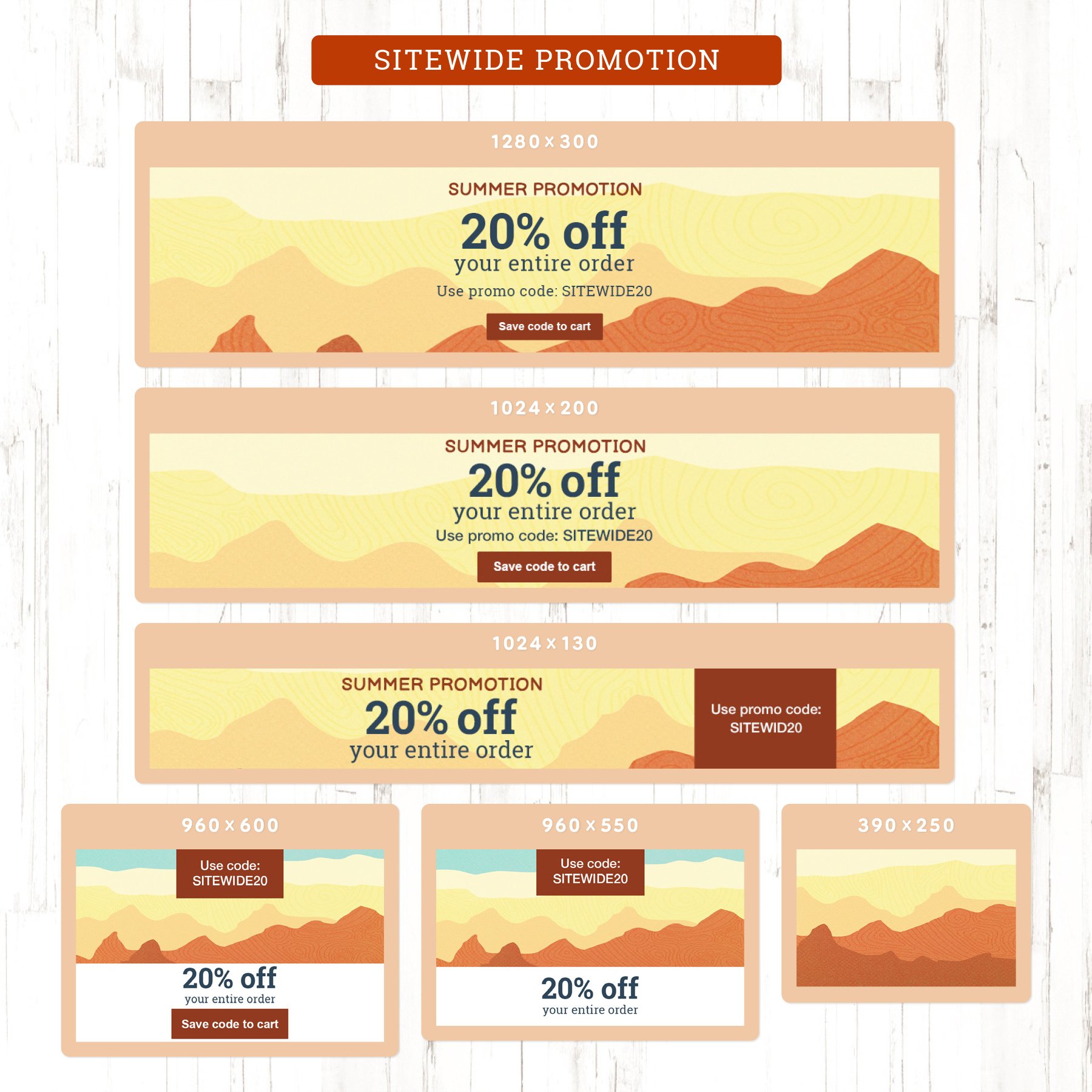
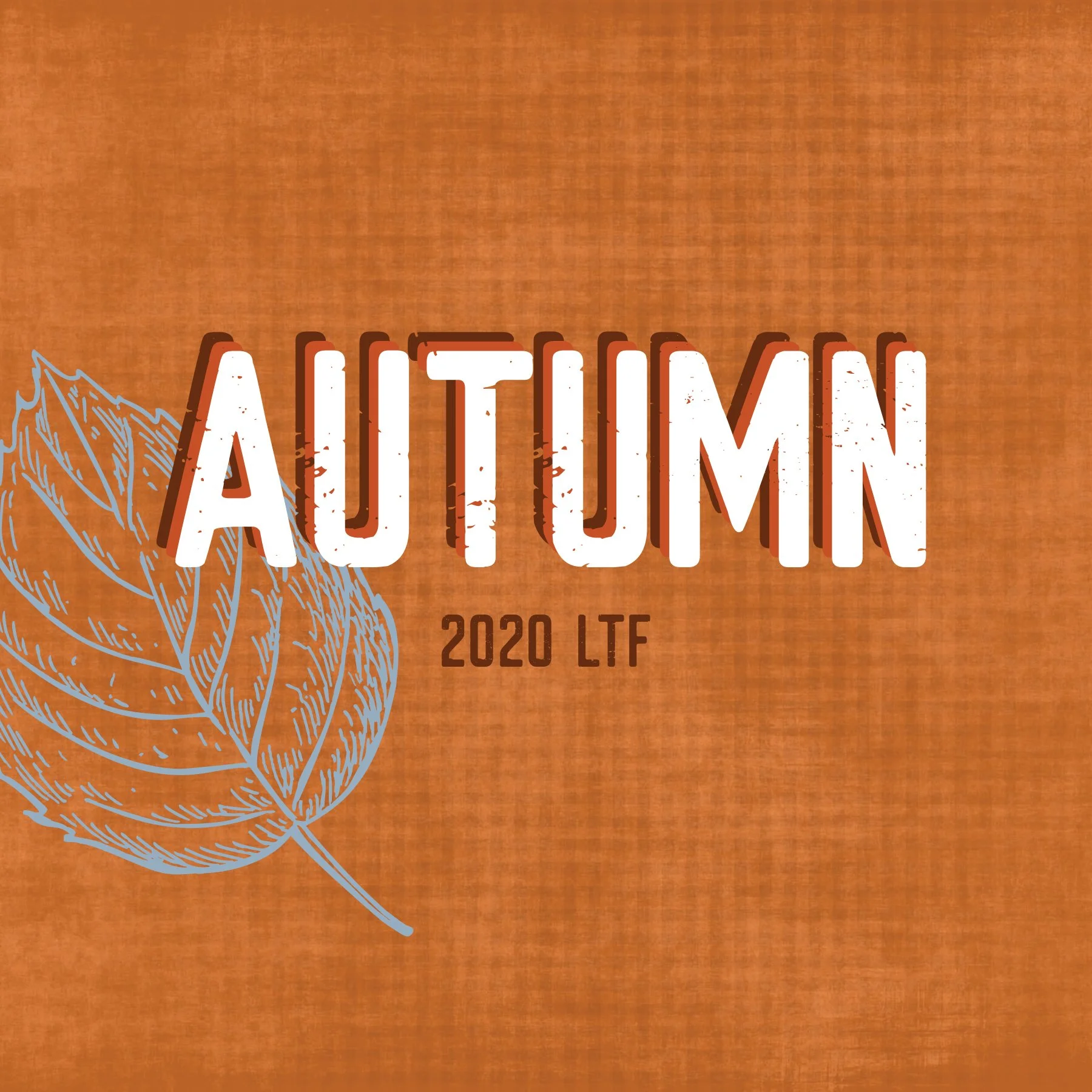
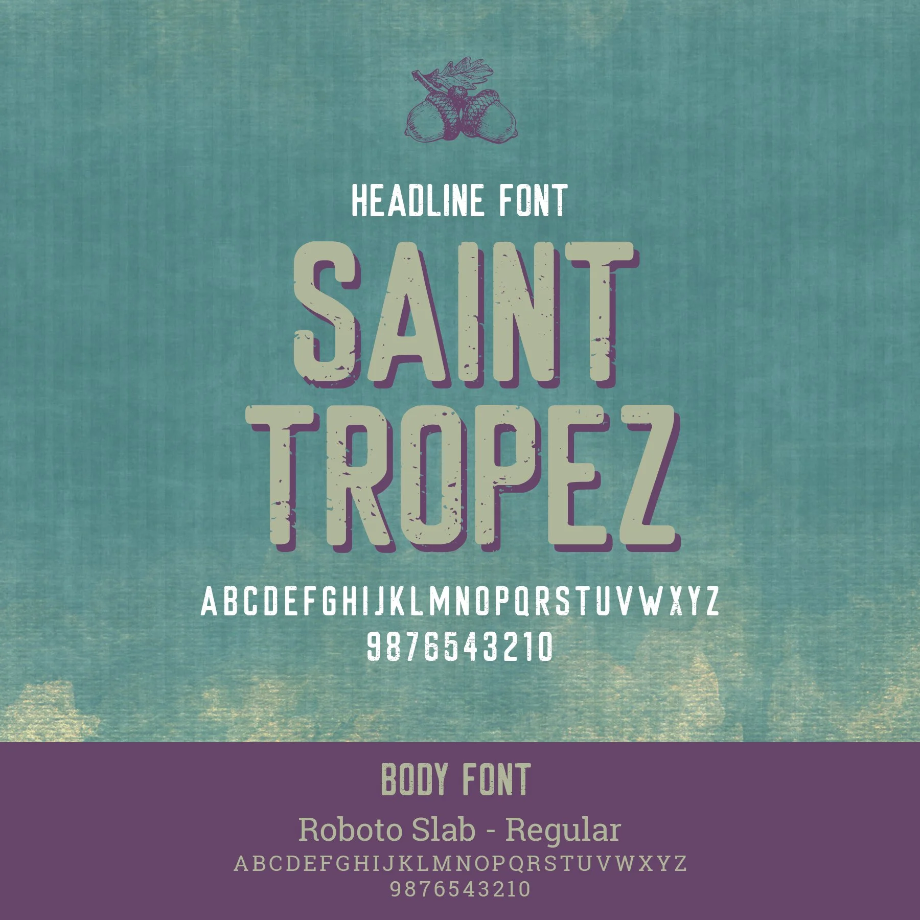
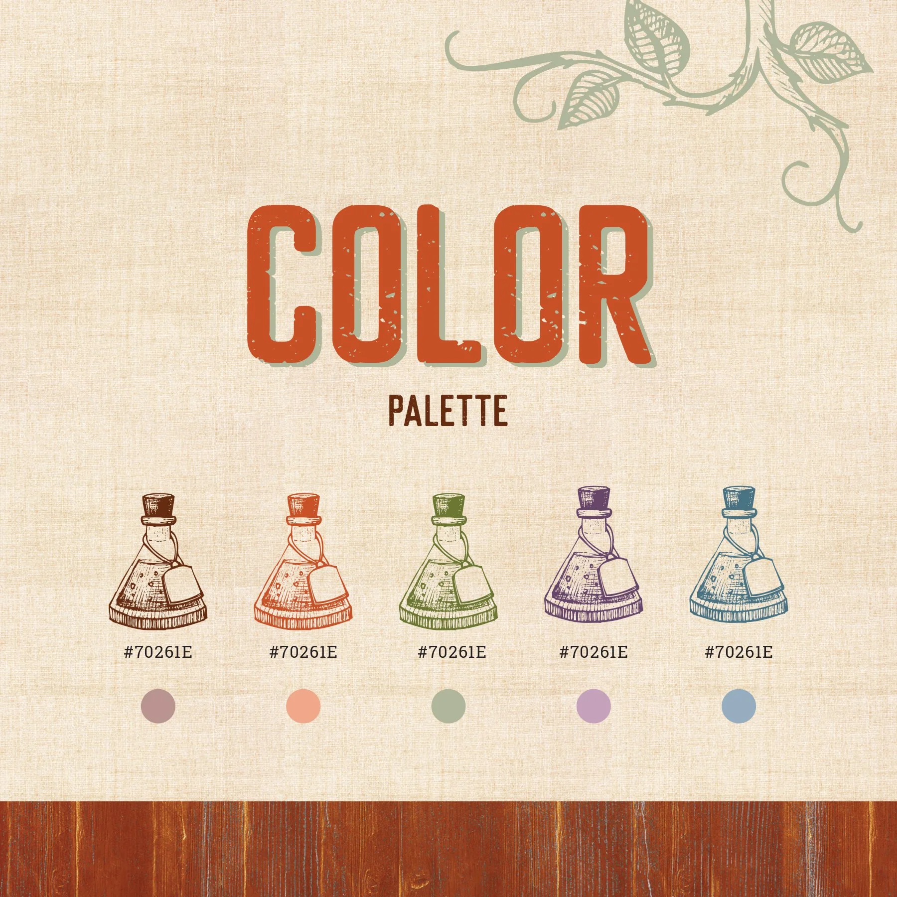
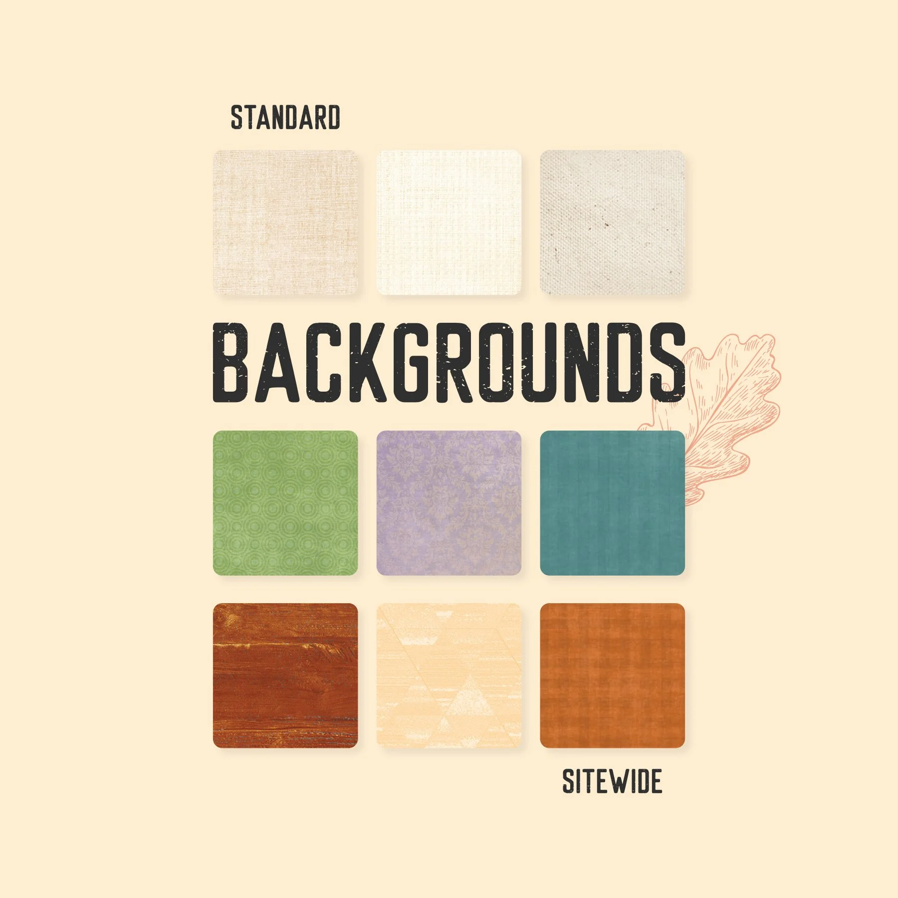
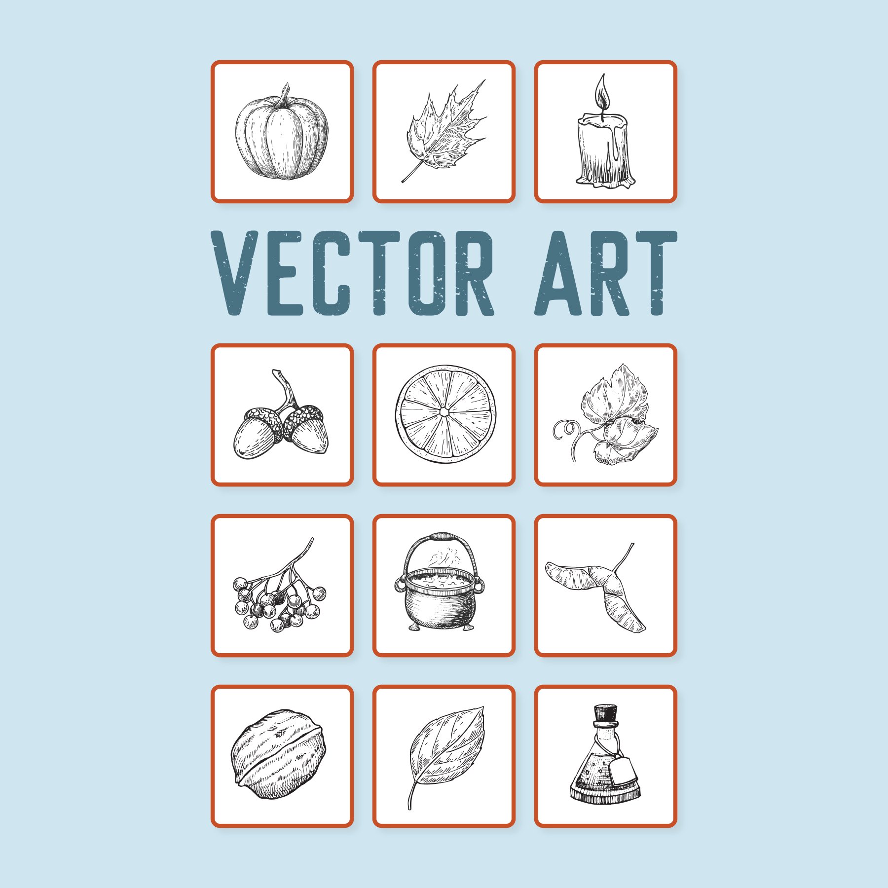
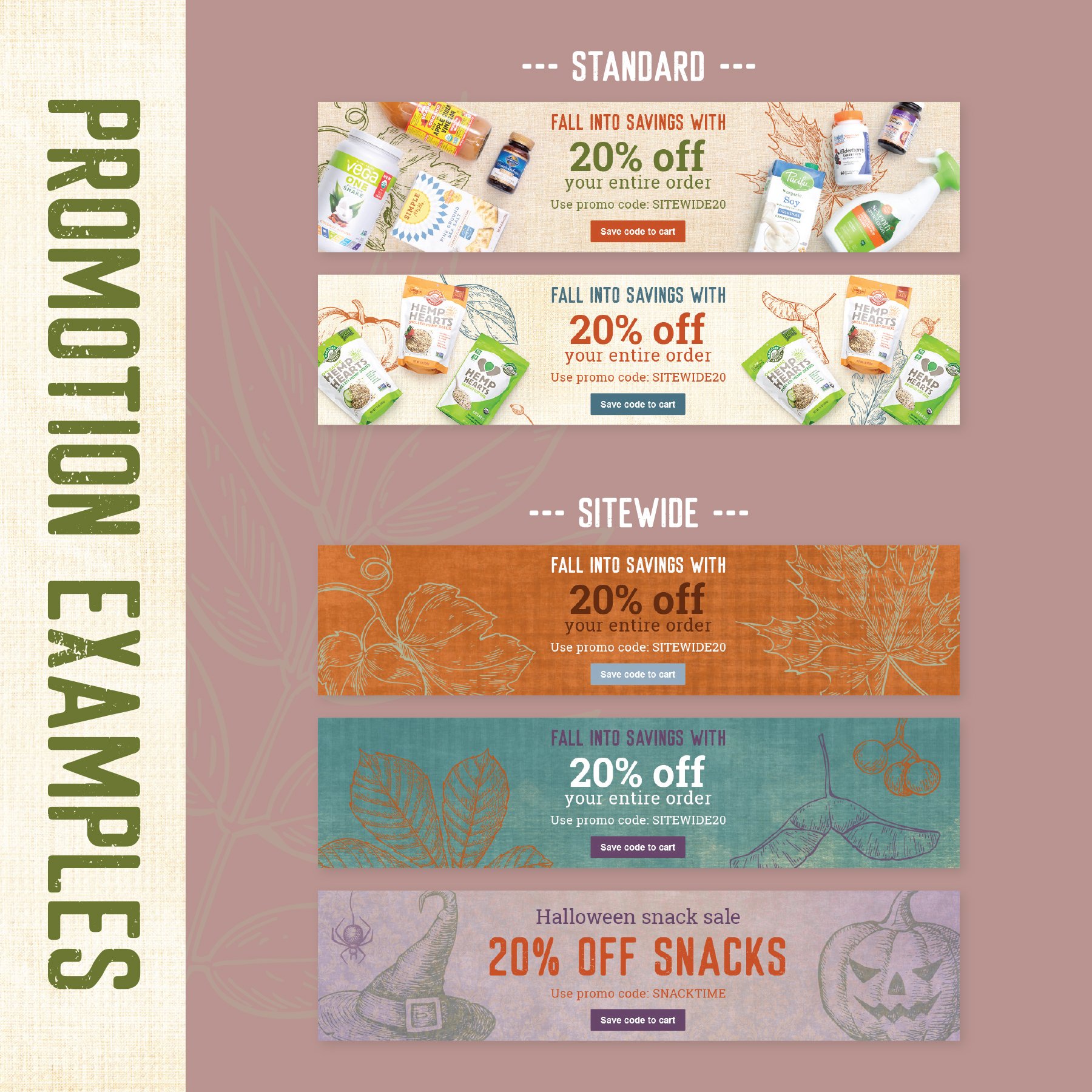
In phase two, Vitacost adopted seasonal look, tone, and feel guides to give each period its own distinct creative direction. I shaped these visual systems from the ground up, choosing the fonts, colors, textures, and supporting graphics while defining how they worked together across promotional layouts. The three guides below are among my favorite explorations.