Vitacost Branded Campaigns
A major part of my role as senior graphic designer at Vitacost was building complete visual systems for large-scale event campaigns. From logos, icons, and color palettes to promotional banners, paid media, and email templates, I created cohesive assets that carried each campaign across multiple customer touchpoints.
30 Year Anniversary
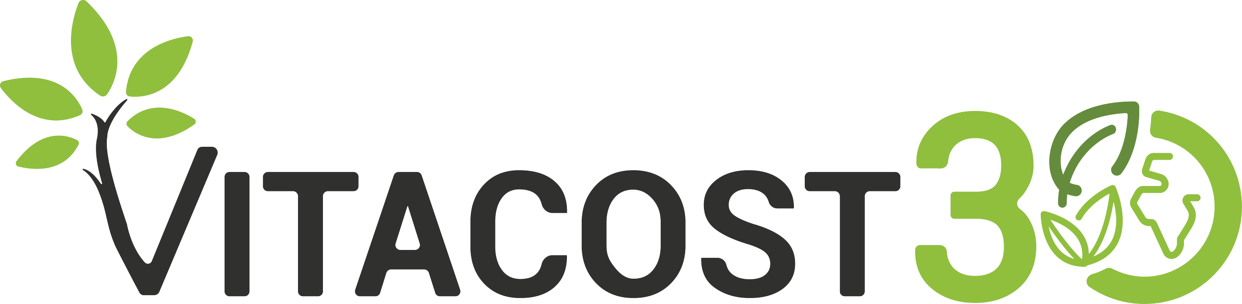
The final design was inspired by Vitacost’s 30-year history of shipping products to customers around the world.
Alternate Orientations
These two icons were designed for use as stamps and within smaller-format applications. The icon shown on the left also served as Vitacost’s app icon throughout the campaign year.

Alternate Proposals
30 Thursdays
This promotional campaign ran alongside Vitacost’s broader 30th-anniversary celebration. Its visual direction needed to complement the anniversary branding while maintaining a distinct identity of its own.
Alternate Colors
Additional colors from Vitacost’s brand palette were introduced throughout the year to keep the campaign feeling fresh and visually varied.
Assets

This is an example of a homepage rotator for desktop and mobile which also doubled as a template.


Homepage Mockup
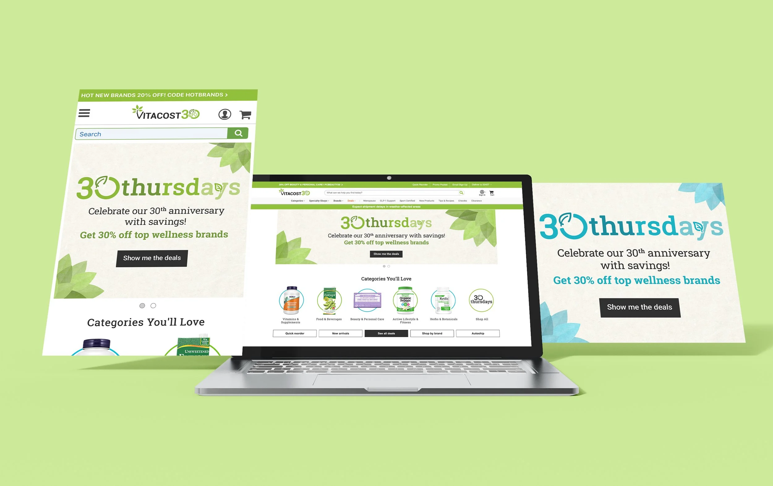
This mockup demonstrates how the campaign logo and banners appeared together on the Vitacost homepage.
25 for 25
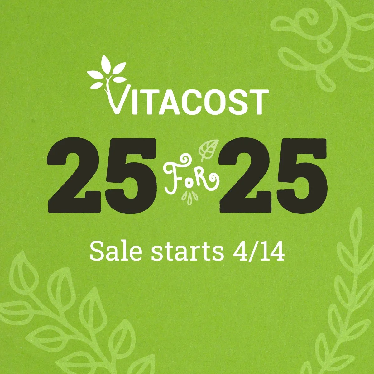
This was a promotional campaign that ran the entire year and involved selling 25 in-demand products for 25% off.
Alternate Colors
Additional colors from Vitacost’s brand palette were introduced throughout the year to keep the campaign feeling fresh and visually varied.
Assets
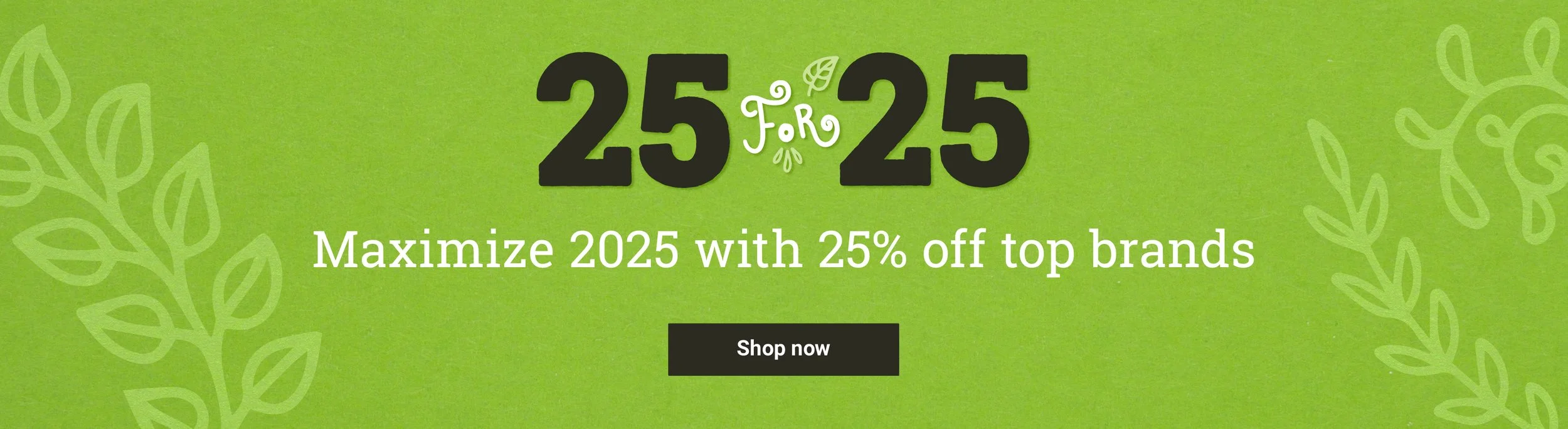
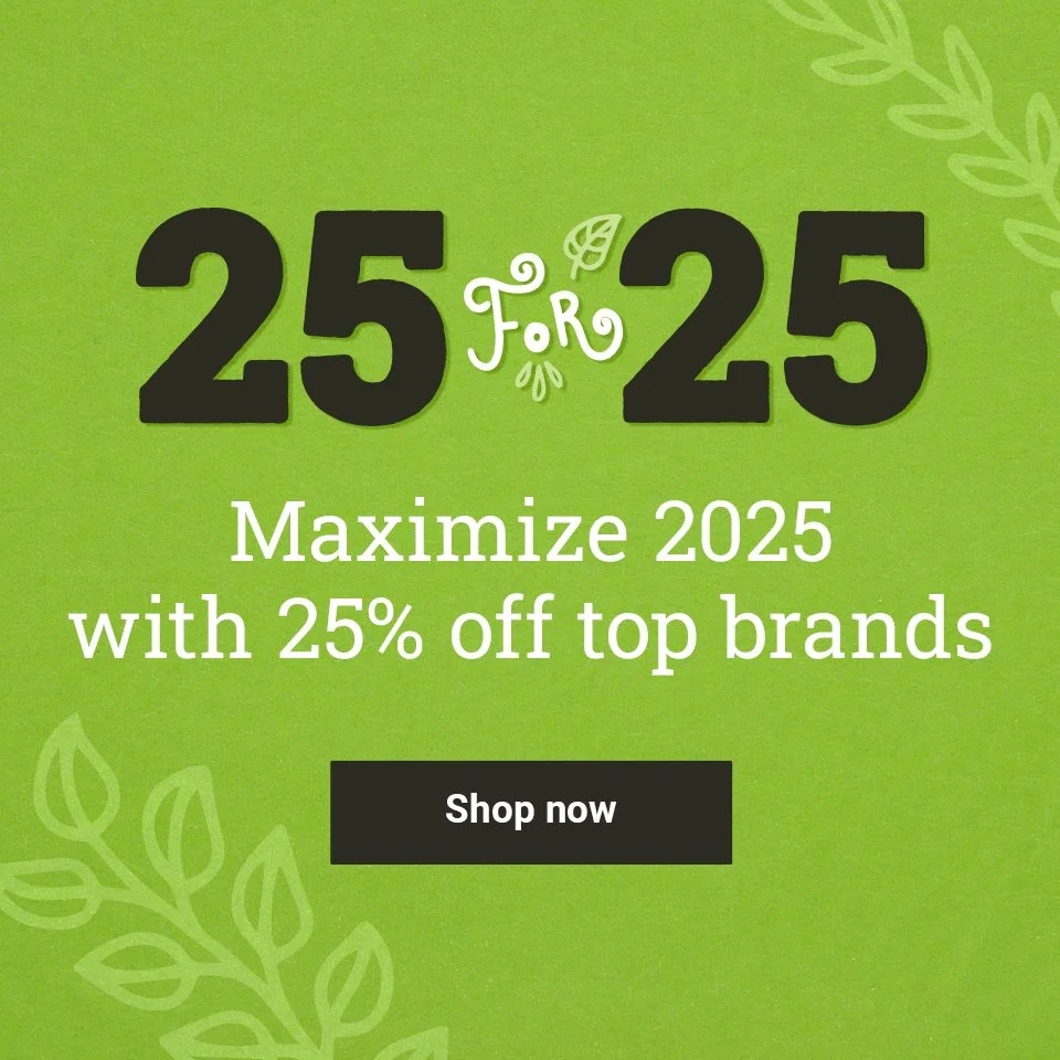
This is an example of a homepage rotator and SRP banner for desktop and mobile which also doubled as a template.

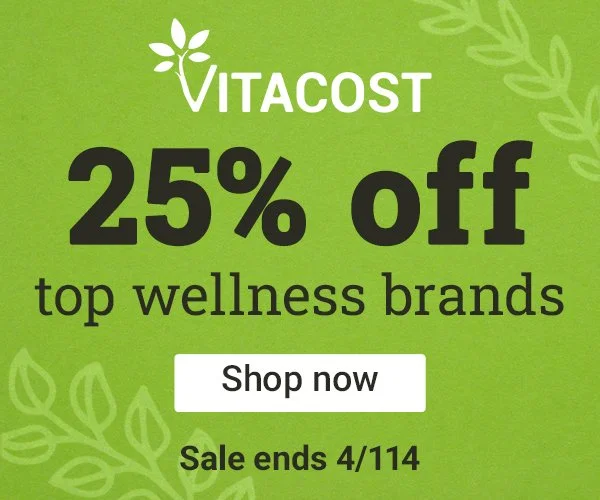
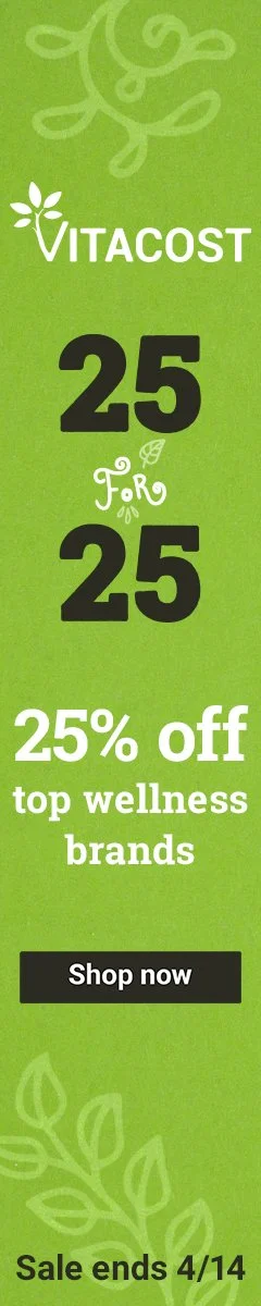
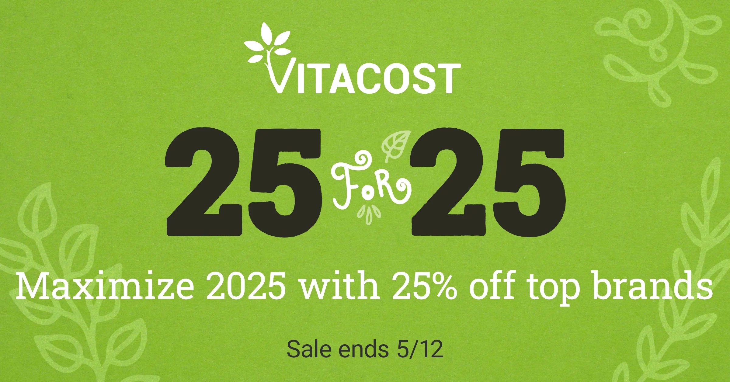
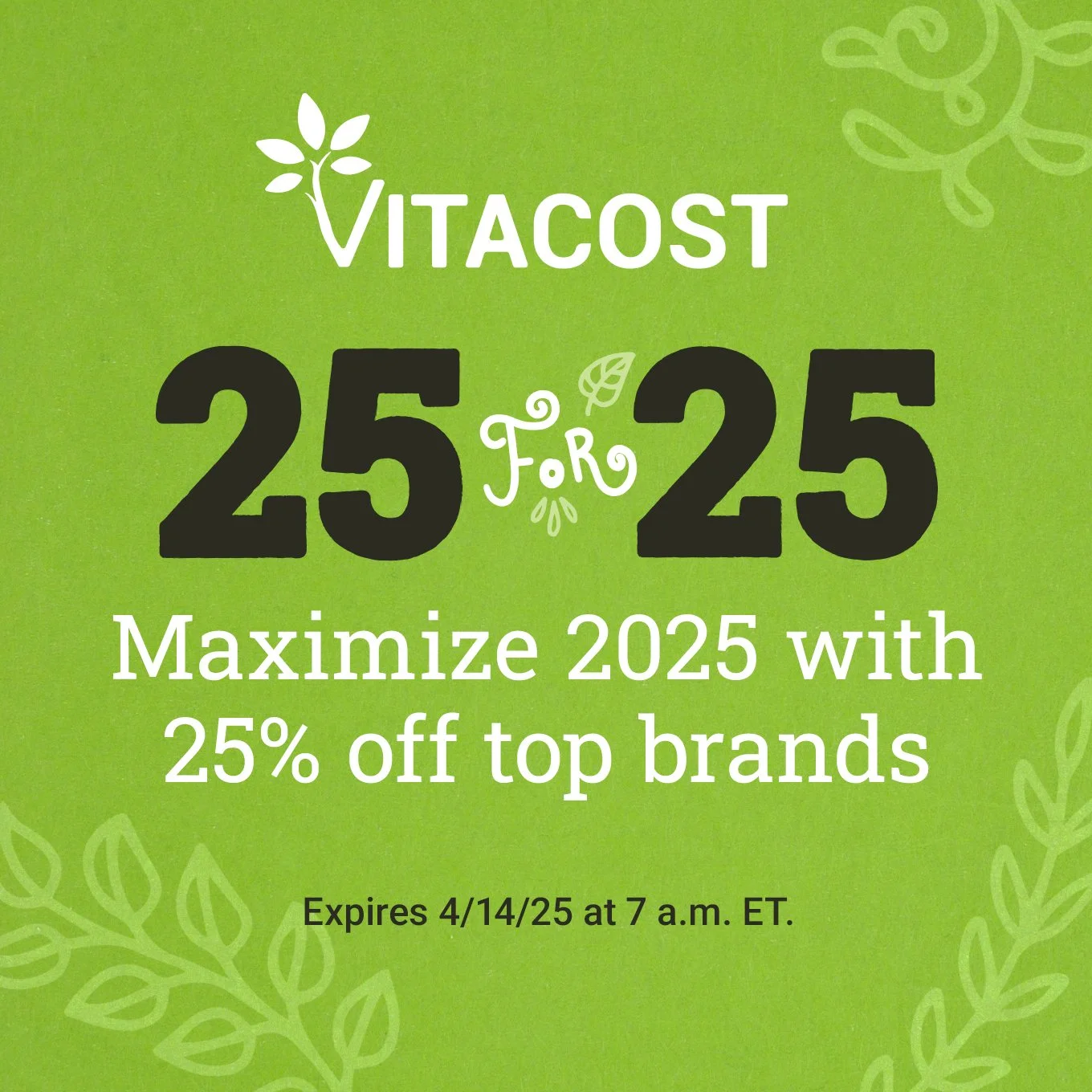
Paid Media Assets
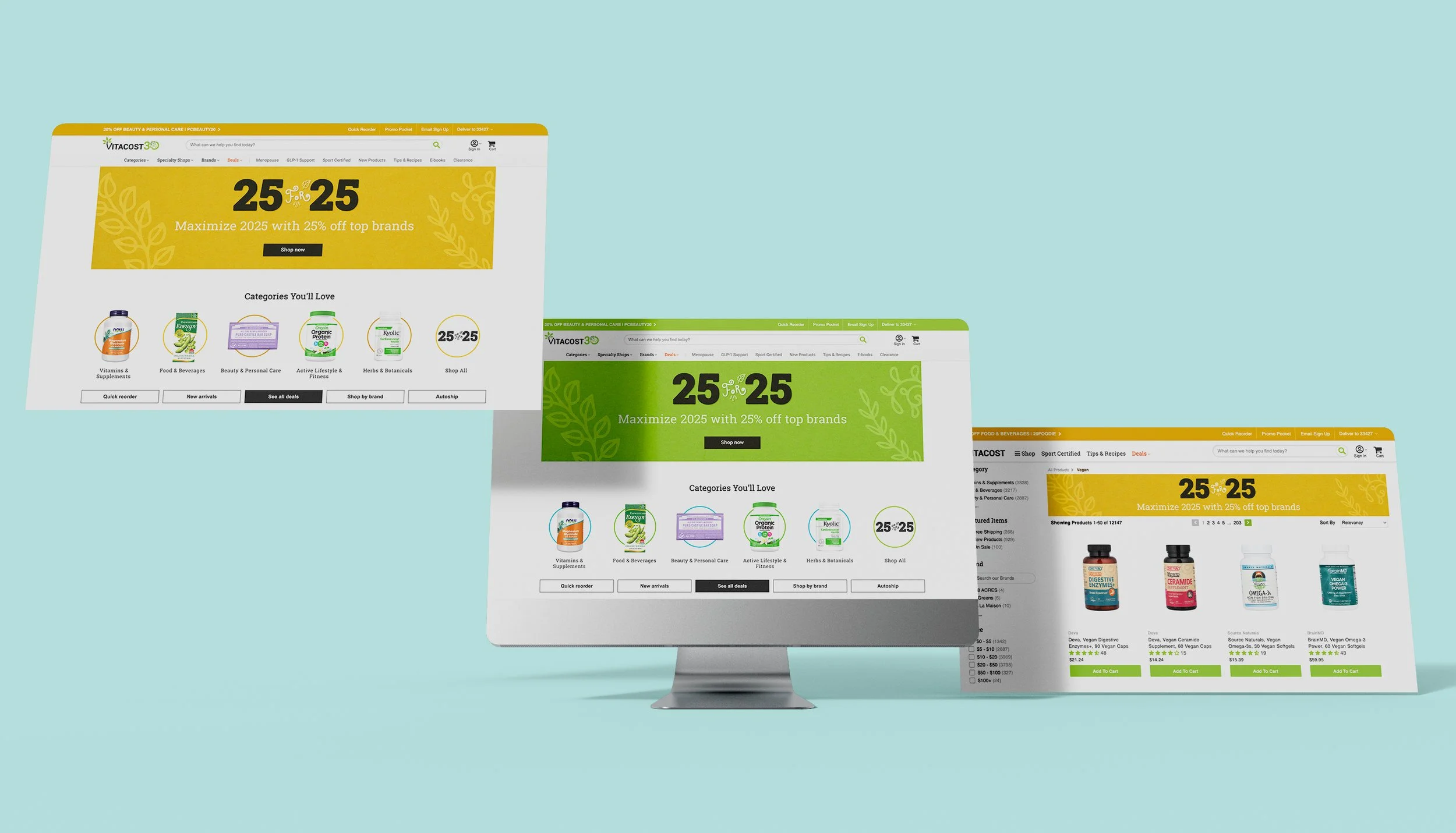
Homepage Mockup
This mockup demonstrates how the campaign logo and banners appeared together on the Vitacost homepage and search results page.
Weekend Exclusives
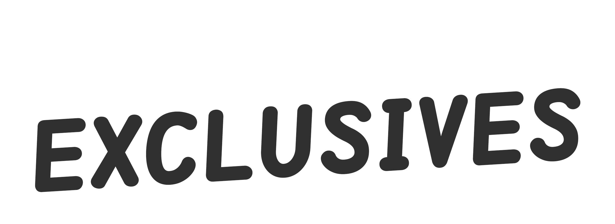
Like 25 for 25, Weekend Exclusives was a year-round campaign featuring a new selection of limited-time offers every weekend. Because of the strength of the promotions, each installment felt more like a miniature tentpole event than a typical sitewide sale.
Alternate Colors

Additional colors from Vitacost’s brand palette were introduced throughout the year to keep the campaign feeling fresh and visually varied.

Alternate Proposals
Site Assets
This is an example of a homepage rotator and SRP banner for desktop and mobile which also doubled as a template.



Alternate Colors
To keep the campaign evolving throughout the year, I incorporated different colors from Vitacost’s established palette. Deeper shades formed the foundation of the visual identity, giving the design a rich, elevated, and naturally inspired feel.



Homepage Mockup
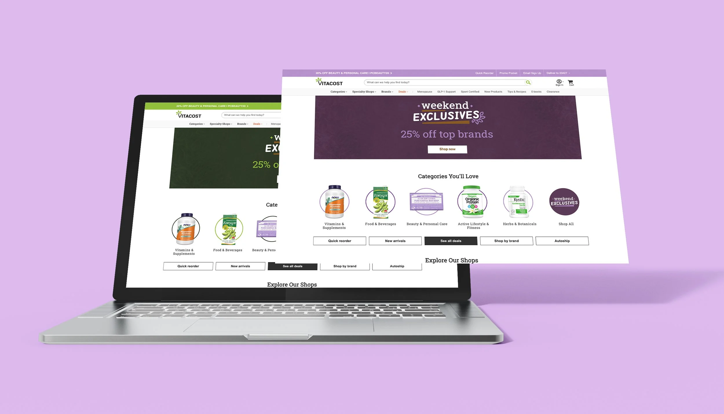
This mockup demonstrates how the campaign logo and banners appeared together on the Vitacost homepage.